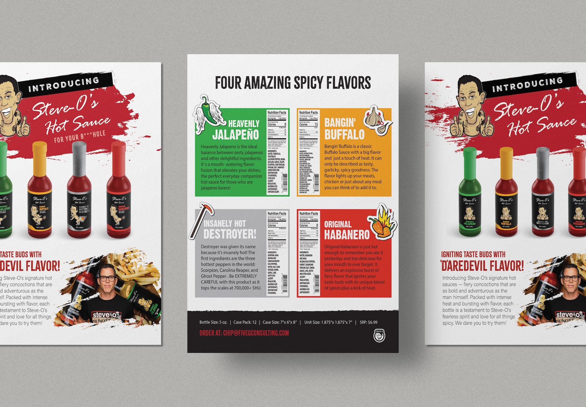
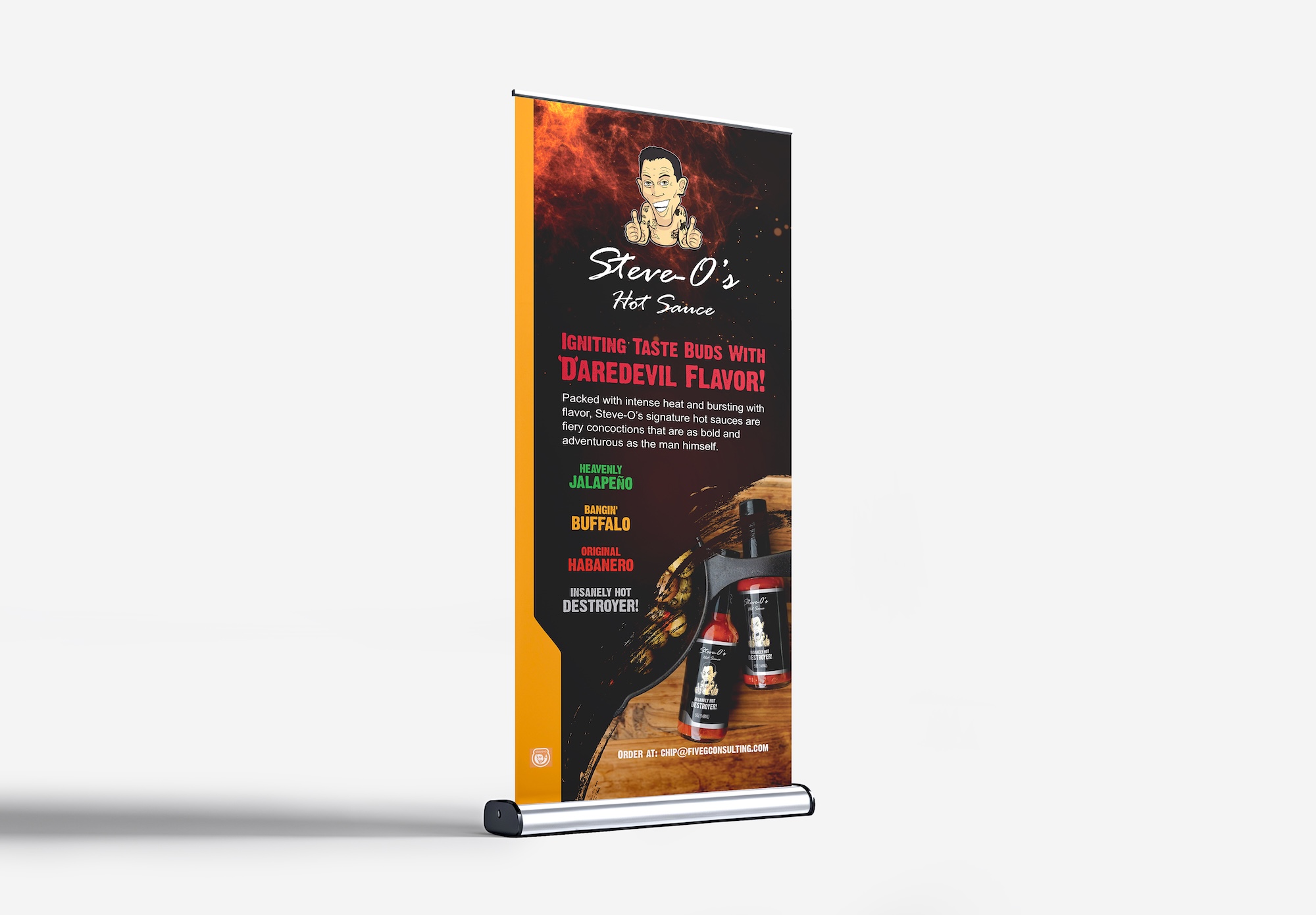
Steve-O's Hot Sauce is a line of four bold, personality-driven sauces built around the irreverent spirit of Steve-O himself. I designed the launch sales sheets, flyers, and banners — including two takes on the sales sheet: a clean retail version and an adult “dirty” cut that leaned all the way into Steve-O's brand of humor.
Design that matches the man.
Steve-O's personal brand is fearless, loud, and unapologetic. The hot sauce line needed design work that matched that energy — sales sheets, flyers, and banners for retailers and fans, with all the personality the brand demanded.
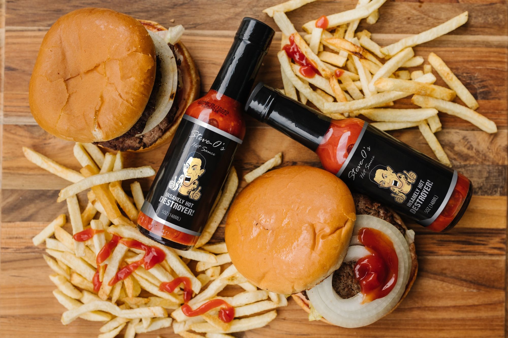
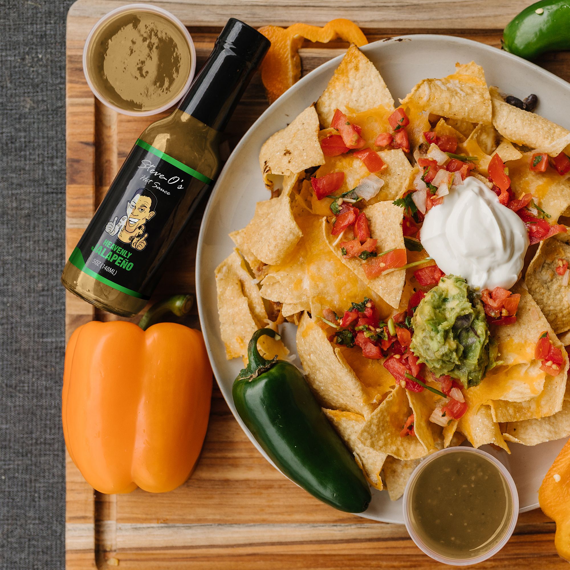
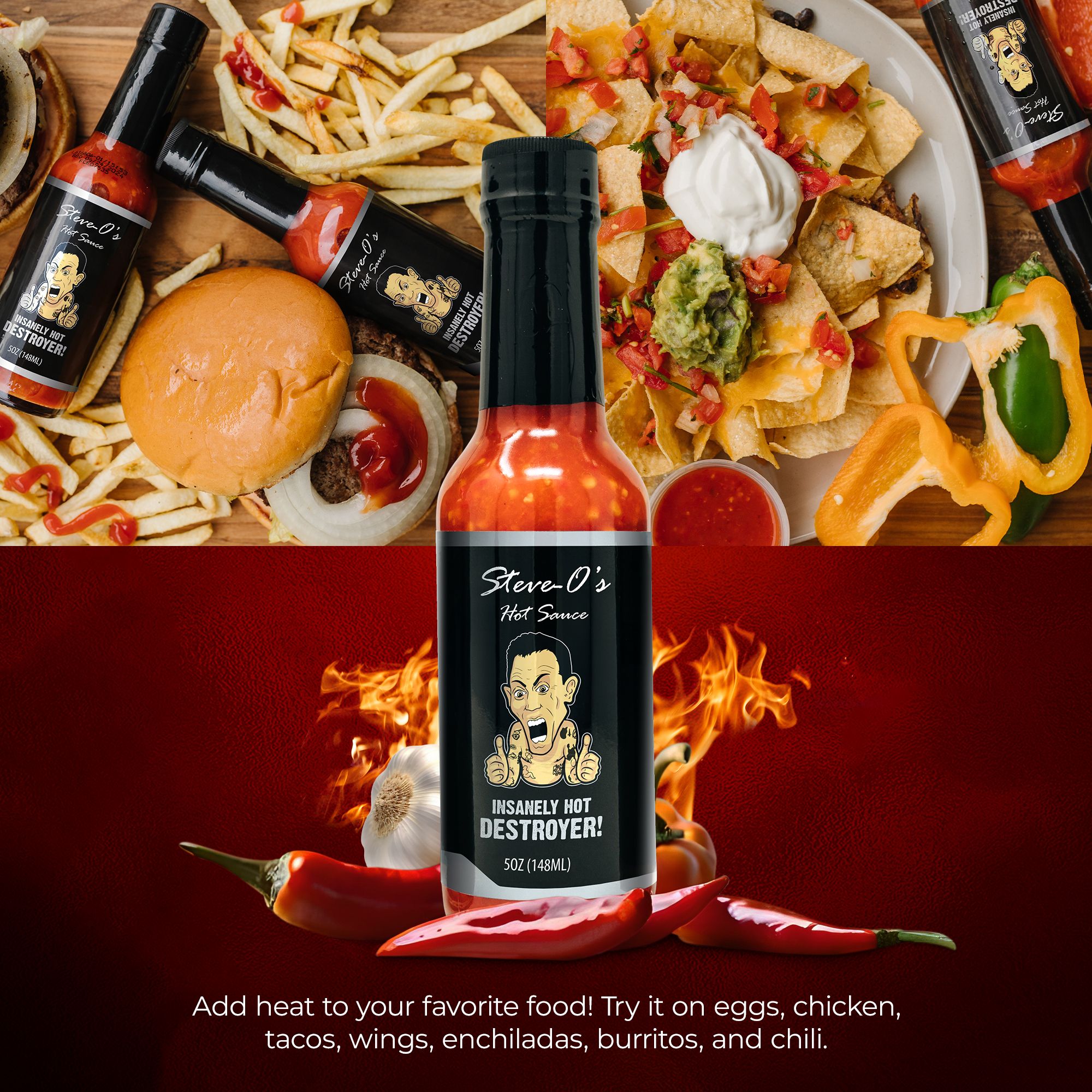
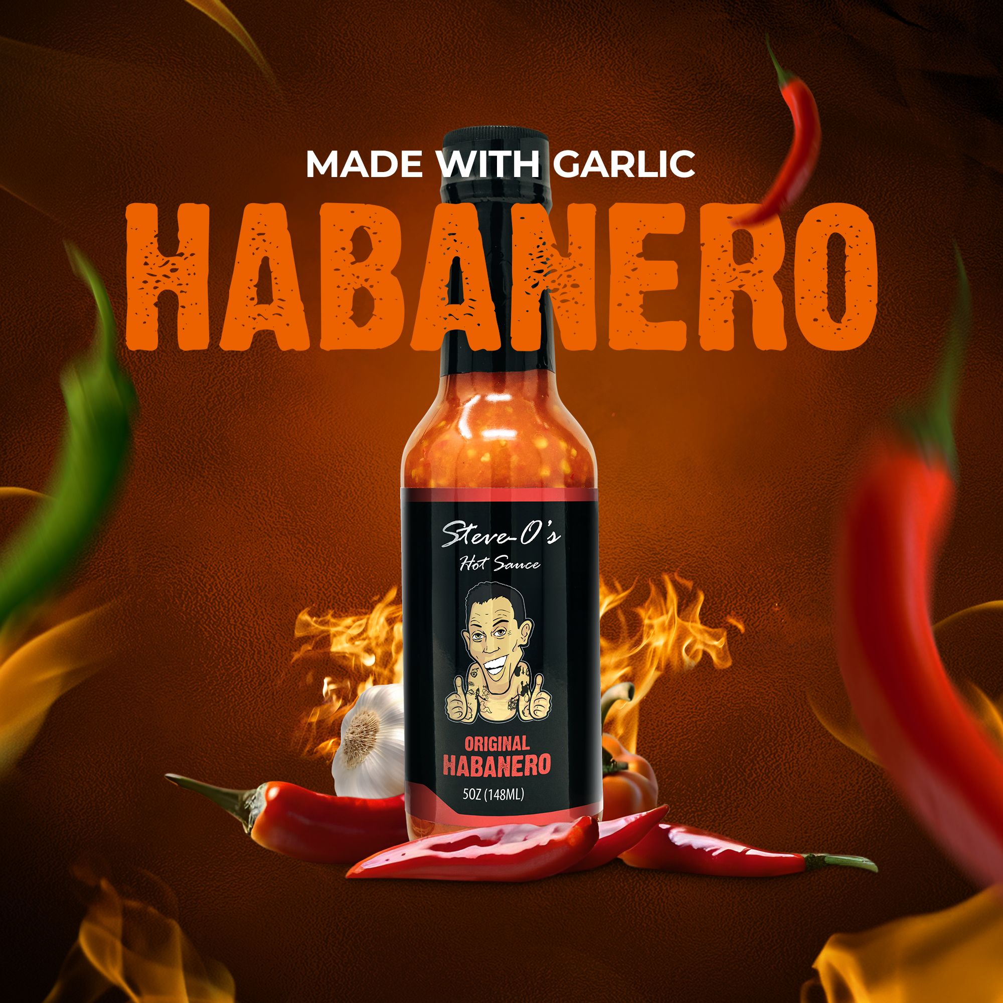
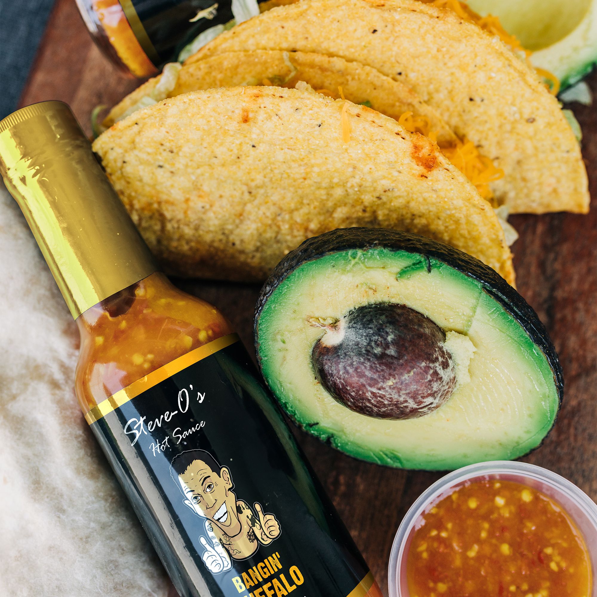
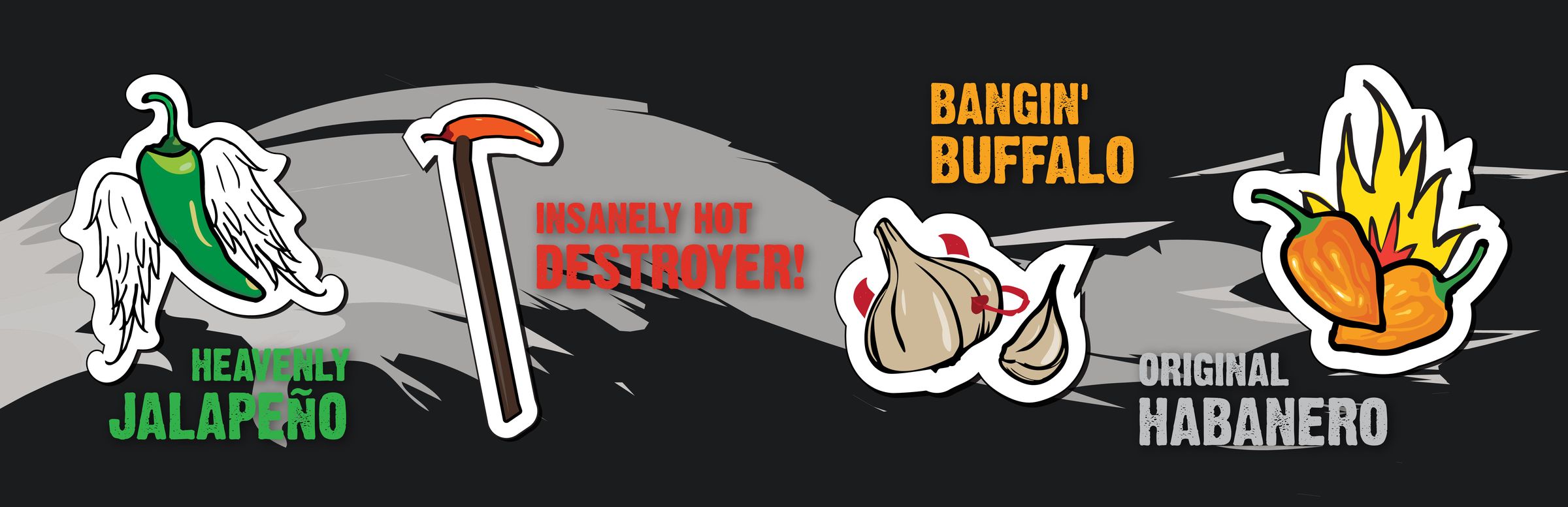
Four flavors, color-coded by heat: Heavenly Jalapeño, Bangin' Buffalo, Insanely Hot Destroyer!, and Original Habanero. The Destroyer tops 700,000 SHU.
Two versions. One brand.
Two sales sheets, same system. Clean for retail buyers and general audiences — professional, punchy, product-forward. Dirty for the fans who expect Steve-O's signature irreverence, tagline and all.
Bold by design.
Hand-lettered script, paint-splatter textures, and a heat-coded palette — green for Jalapeño, yellow for Buffalo, silver for Destroyer, red for Habanero. Flyers and banners carried the same system across every promotional context.
A faithful translation.
Steve-O sat at the intersection of celebrity brand and consumer product, and the work was figuring out how to give it a system that could go both places. The clean/dirty split solved a real problem: retailers want a deck they can take into a meeting, fans want the version that sounds like the guy on the label.
Designing for a personality this defined is less about inventing something new and more about translating something that already exists — faithfully, without softening the edges that make the brand work in the first place.