Lief Labs is a leading dietary supplement manufacturer based in Santa Clarita, CA. Over four years as an in-house designer and brand strategist, I led the brand's expansion and rebrand, evolving the visual identity, defining brand standards, and building the systems and campaigns that shaped how Lief Labs presents itself.
→ Visit SiteScope
Tools
The Challenge
A Brand That Had Outgrown Itself
Lief Labs had become one of the leading supplement manufacturers in the industry, but the brand didn't show it. The visual identity was outdated and no longer reflected the company's actual scale, depth, or ambition. More critically, the brand had no clear strategic foundation: no defined positioning, no differentiated messaging, and no unified voice.
The work started long before anything visual was touched. Together with a cross-functional team and input from leadership, I led a comprehensive brand research and strategy phase, auditing the competitive landscape, clarifying the target audience, and developing a Value Proposition and Visual Positioning Strategy (VPS) to anchor everything that followed.
Research & Strategy
The Insight That Changed Everything
The competitive audit revealed a crowded landscape of manufacturers all saying the same things: "innovative," "high quality," "science-backed." The words had become noise. The insight was simple but clarifying: stop competing on the claims everyone else was making, and own what actually made Lief different.
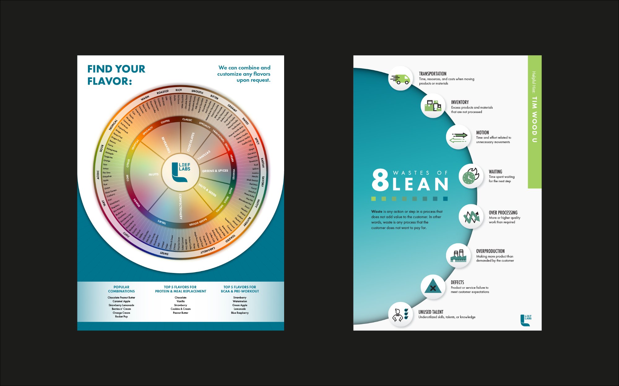
That meant leaning into Lief's real strengths: a focus on custom formulation over white label, full-service capabilities from concept to commercialization, and a genuine expertise in flavor development that most competitors couldn't match. These weren't marketing spins; they were operational truths that needed to become brand truths.
Value proposition statement
For supplement brands and founders ready to scale, Lief Labs is the full-service manufacturing partner that delivers custom formulations, end-to-end production, and deep flavor expertise, so you can focus on building your brand while we build what goes inside it. Unlike commodity manufacturers, we don't start from a catalog. We start from your vision.
Brand pillars
Science-backed formulations built to perform and scale.
- Rigorous quality control at every stage
- Ingredients sourced for efficacy, not cost-cutting
- Compliant, credible, market-ready
Custom formulation from concept to commercialization.
- No white label: every product is built for your brand
- Flavor expertise that drives repeat purchase
- Flexible formats across categories
A true partner invested in your brand's long-term success.
- Dedicated support from brief to launch
- Transparent, collaborative process
- Built for brands that are scaling, not starting
Tone of voice
Premium & authoritative
Confident without arrogance. Lead with expertise, not hype.
“Lief Labs doesn’t follow trends. We formulate ahead of them.”
Scientific & credible
Specific over vague. Proof over promise.
“Every formula starts with the data, not the label.”
Partnering & collaborative
Speak like a partner in the room, not a vendor.
“Your vision, our expertise. Let’s build something worth taking.”
Clear & direct
No jargon for its own sake. Say the real thing, simply.
“We make supplements that work. That’s the whole job.”
Words & claims to avoid
Visual Identity
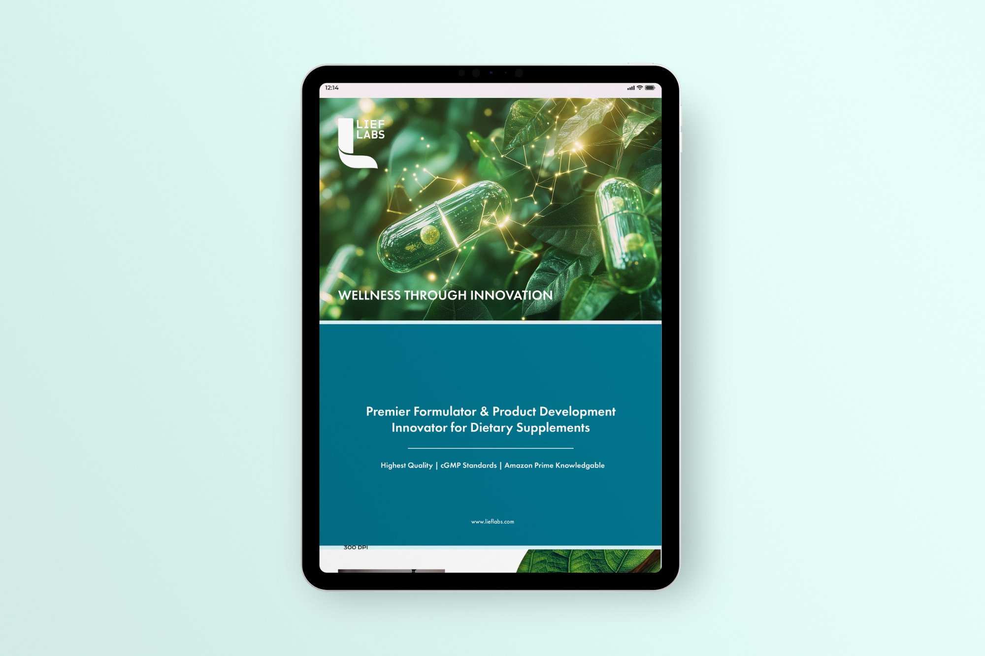
Premium, Energetic, and Built to Last
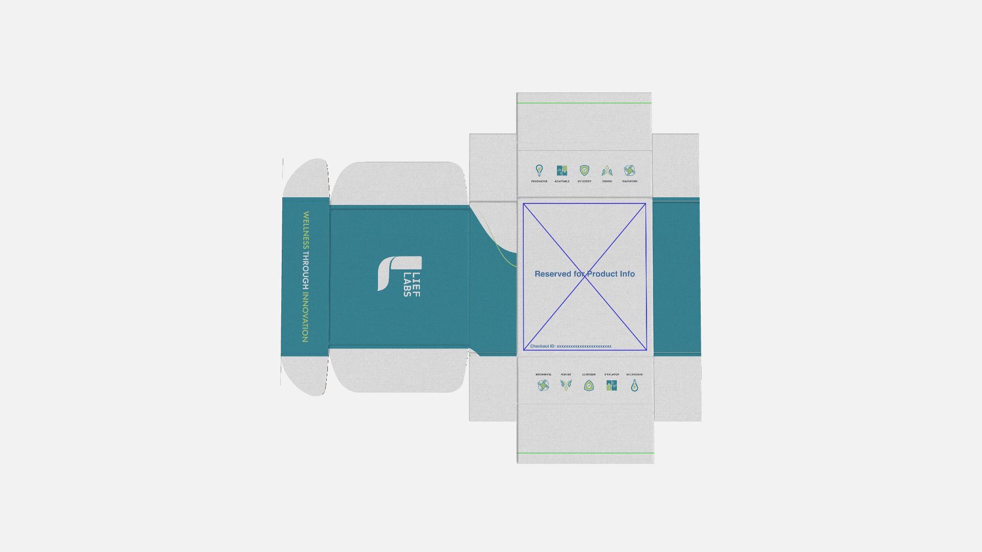
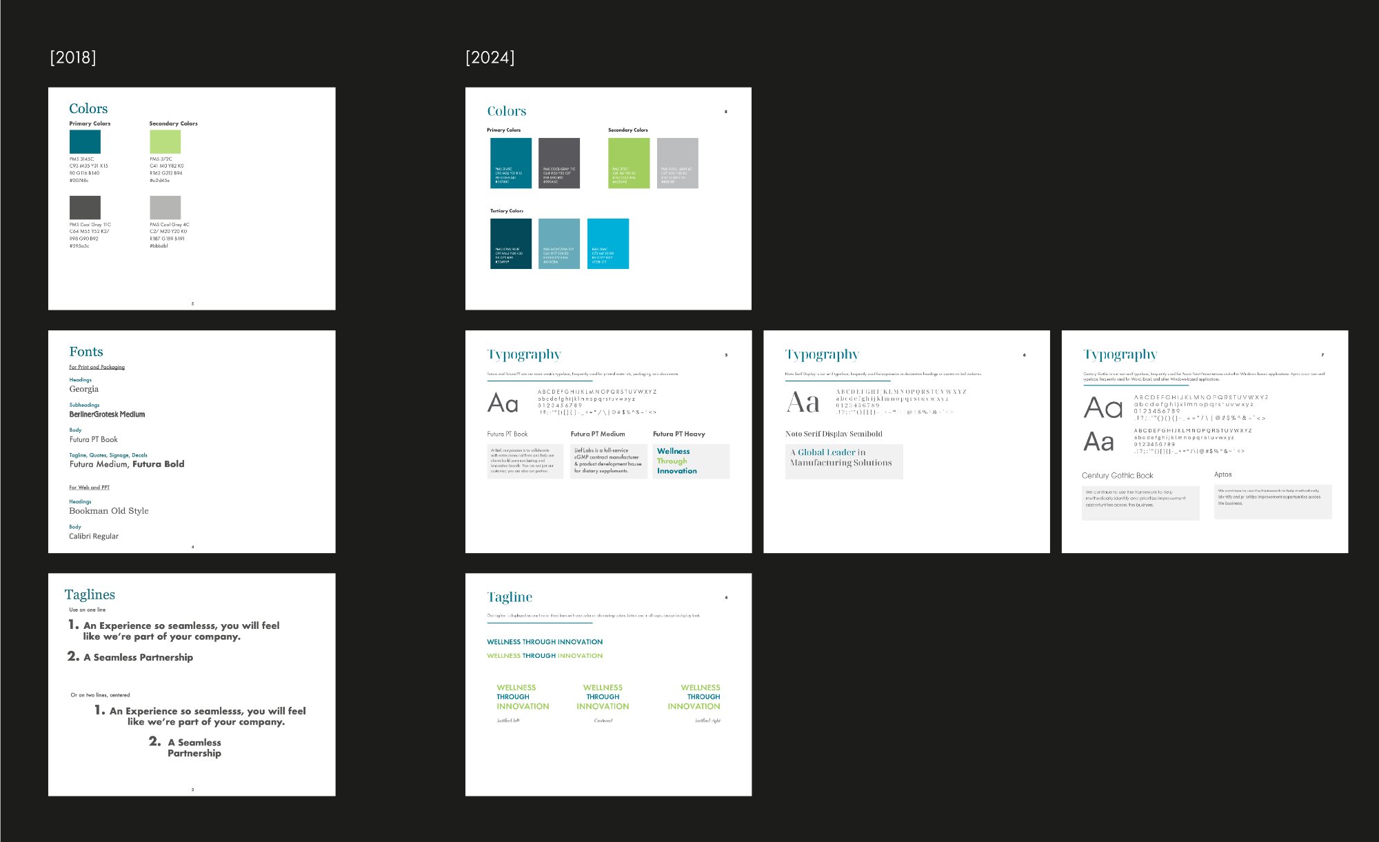
With strategy in place, the visual work began. The updated color palette introduced more energy and dimensionality: a richer system that gave the identity depth and flexibility across every application.
Typography was overhauled to feel more premium and authoritative. Every decision, from hierarchy to weight contrast, reinforced the elevated positioning the strategy had defined.
The result was a visual system that remained recognizable but was significantly more refined, consistent, and built to hold up in high-stakes environments: trade shows, investor materials, enterprise sales.
Brand System & Rollout
A System People Actually Use
The updated brand was documented in comprehensive guidelines and rolled out across every touchpoint: sell sheets, brochures, email templates, social frameworks, digital ad templates, and trade show materials, ensuring the new identity landed consistently whether a client encountered Lief in their inbox, on a show floor, or through a sales call.
The guidelines were built to be practical, clear enough that internal teams and external partners could apply the brand correctly without constant oversight. That meant going beyond rules and actually showing how the brand behaves in real contexts.