Lief Labs had spent almost two decades as the manufacturing partner behind other people's supplement brands. After a brand refresh, the website was the last thing still wearing the old identity — so I led the redesign and rebuild end to end: a new information architecture, the refreshed brand system applied across every page, and a site built to do real work for the sales team.
A site that no longer reflected the company.
Lief Labs had grown in scale, capability, and market position. The website hadn't. For a business where the site is often the first point of contact, the gap mattered.
Structure first, then visual.
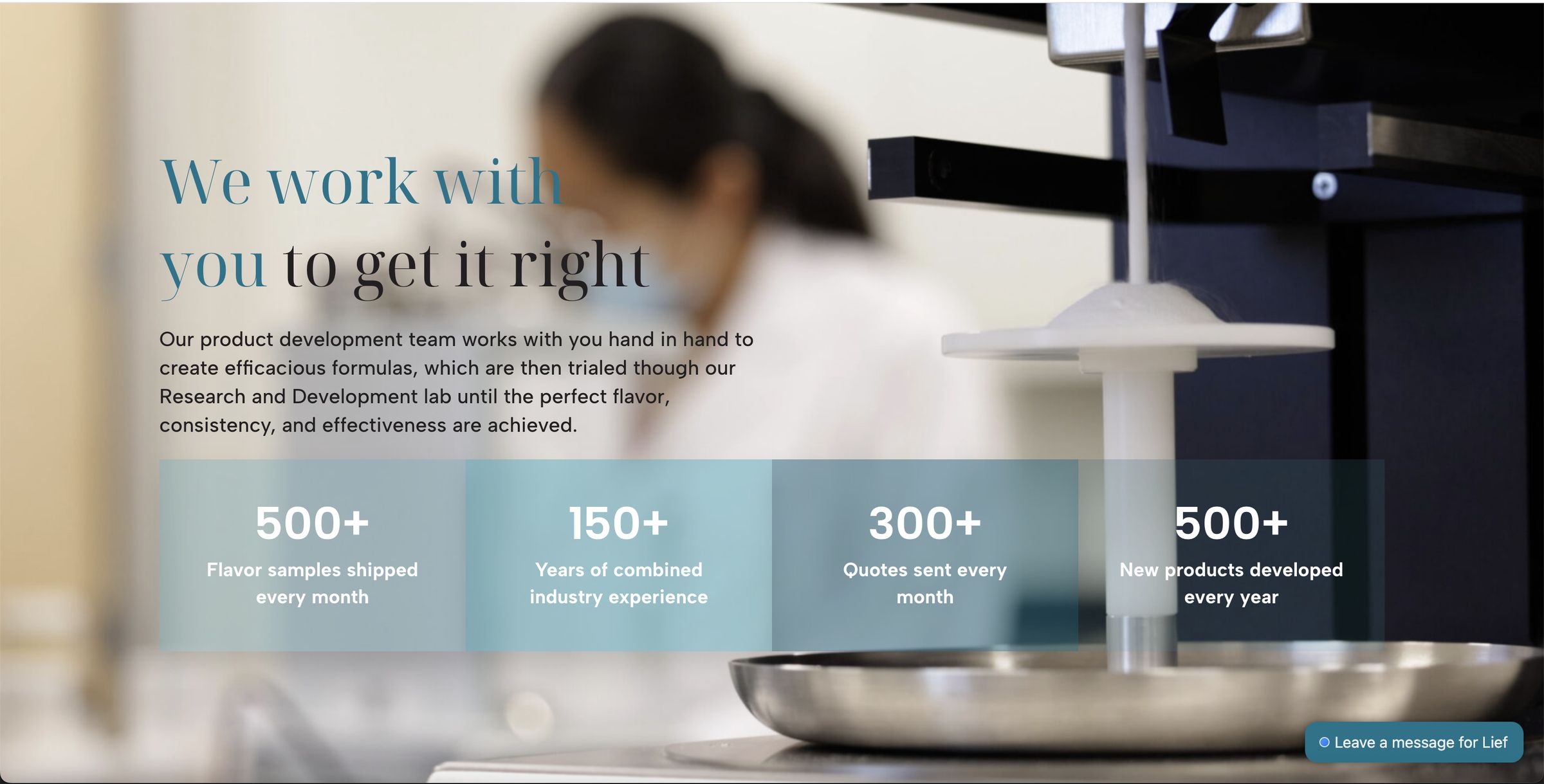
The work was structural before it was visual. I rebuilt the architecture around a clearer hierarchy and distinct pathways for the two audiences Lief serves — brand partners and enterprise clients.
Then the visual overhaul: a more premium typographic scale, consistent brand color across components, and an image treatment that finally let the product and science photography lead.
What changed across the redesignTypography
The workhorse sans moved to something more modern and premium, with a display serif added for editorial moments.
Components
Style
A wider, more dimensional take on the palette, paired with a more art-directed image and illustration system.
Content
Three new modules
Customer-story videos, a Tour Our Facilities slideshow, and a Latest News section.
Deeper detail
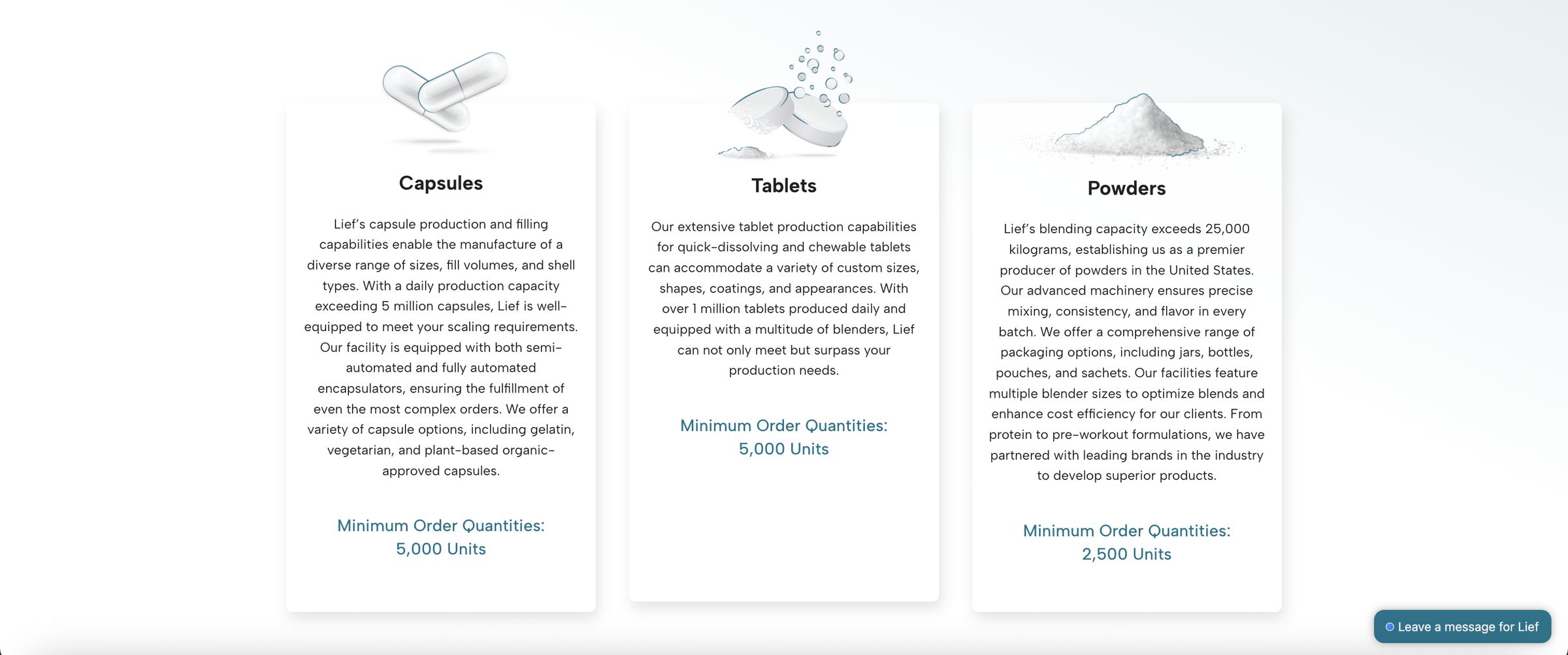
Packaging examples, listed MOQs, and an updated Labeling section.
A new PD section
Innovative concepts from the Product Development & Marketing team — a section I co-led.
Made interactive
New testing icons and an interactive Certifications & Verifications section.
Still evolving.
The site is the living face of the refresh — the place the new identity gets the most miles. It launched as a complete redesign and has kept growing since, with new sections and content added as Lief has.
It's the web half of a larger brand story. See the brand refresh →