Lief Labs is a turnkey product-development and manufacturing partner for the dietary supplement industry, based in Santa Clarita, California — guiding wellness brands from formulation and manufacturing through packaging and fulfillment. As its in-house designer and brand marketing specialist, I supported Lief's branding and marketing functions.
Visit site →Two decades in, ready to look the part.
Lief Labs has succeeded by helping wellness brands bring product to market — from formulation and manufacturing to packaging and fulfillment. It's the kind of partner most shoppers never see, but whose fingerprints are on shelves across the category.
After almost two decades, the brand on paper no longer matched the strategic, design-driven team Lief had grown into. The gap between the two became a real opportunity.
A facelift, not a teardown.
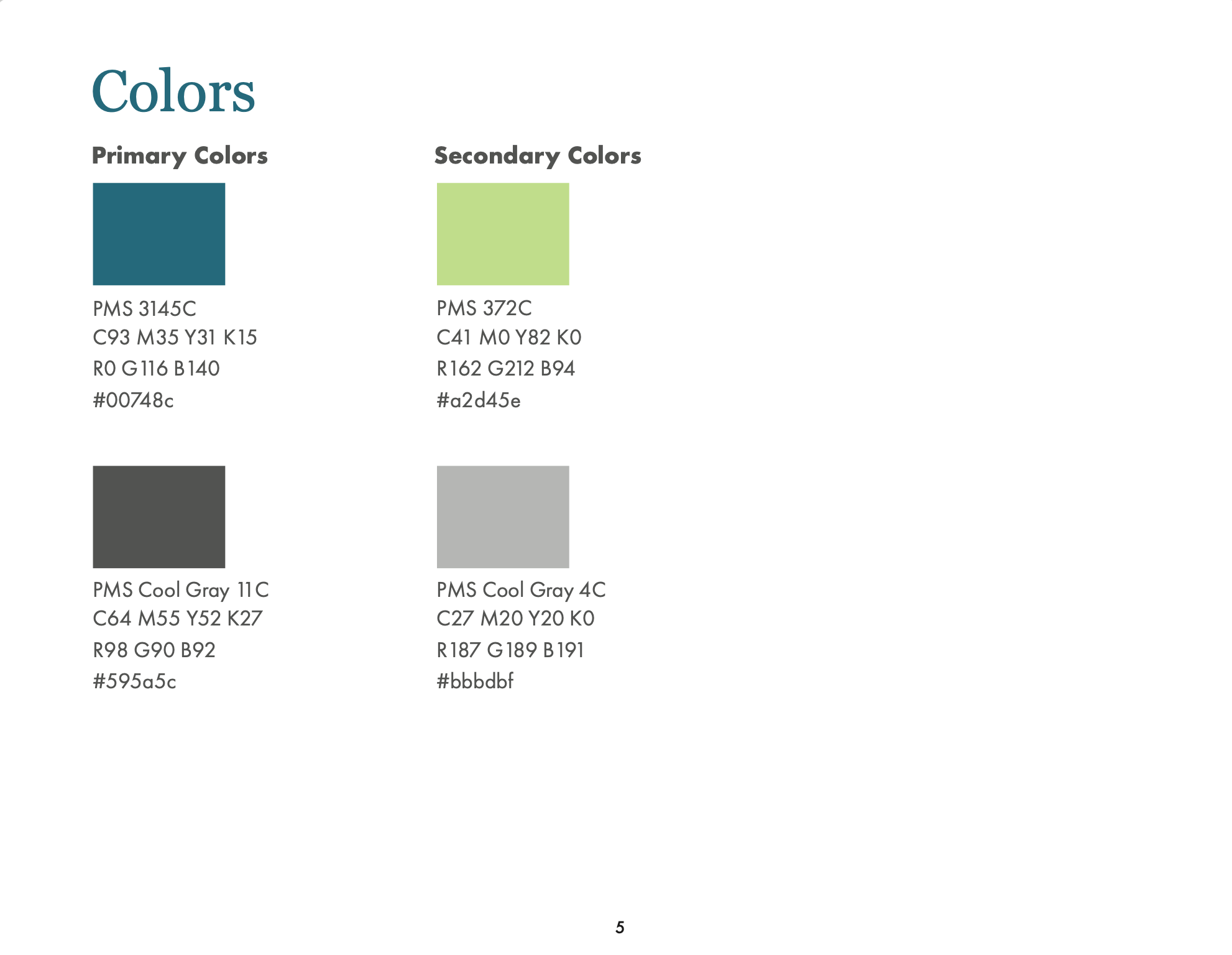
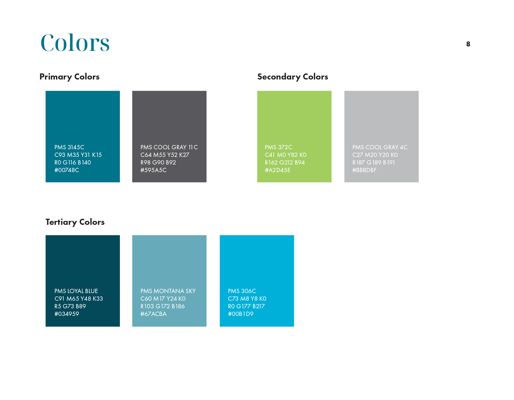
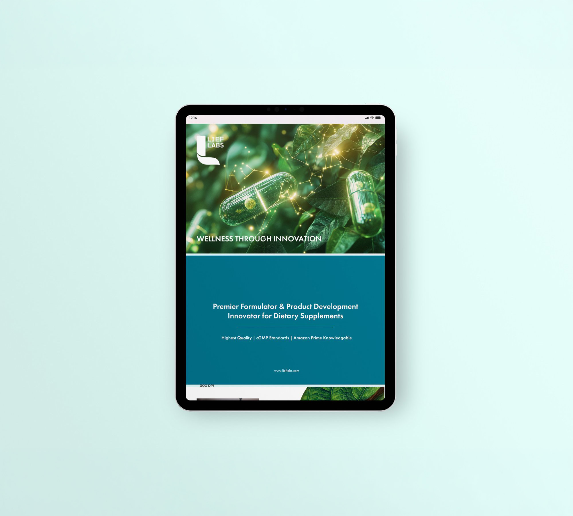
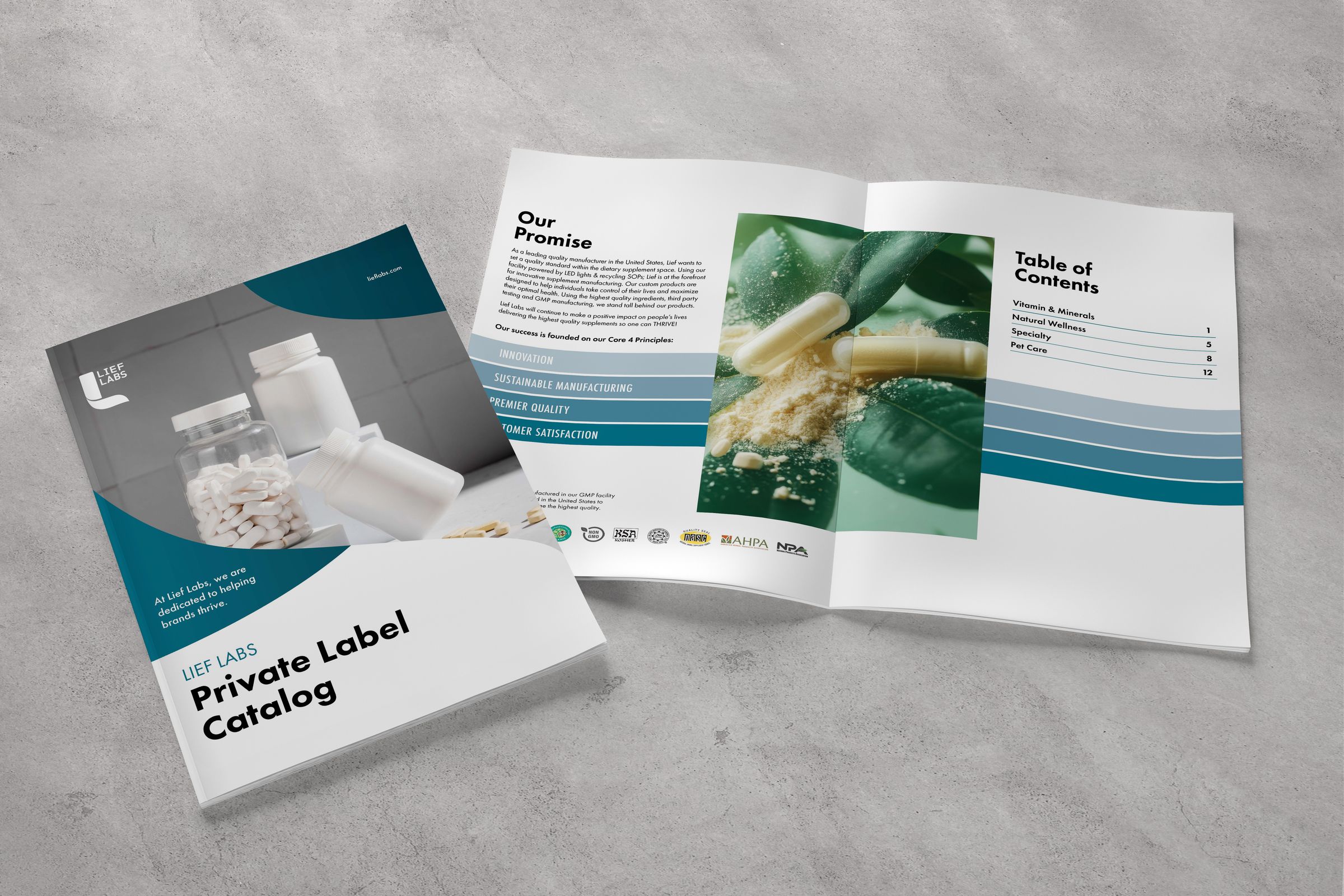
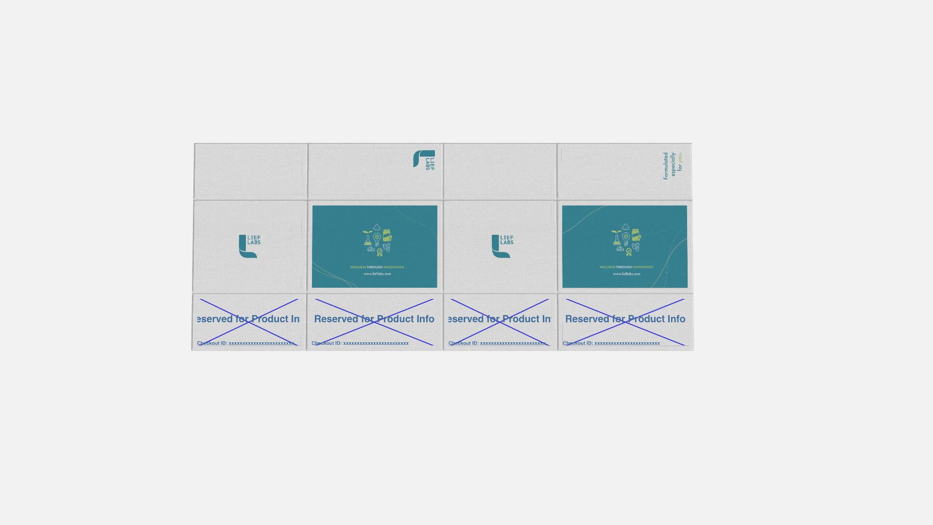
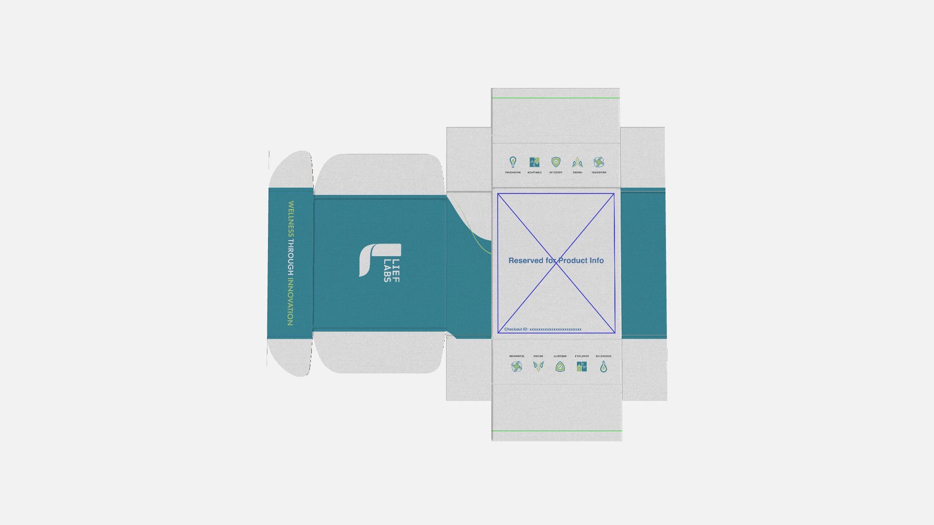
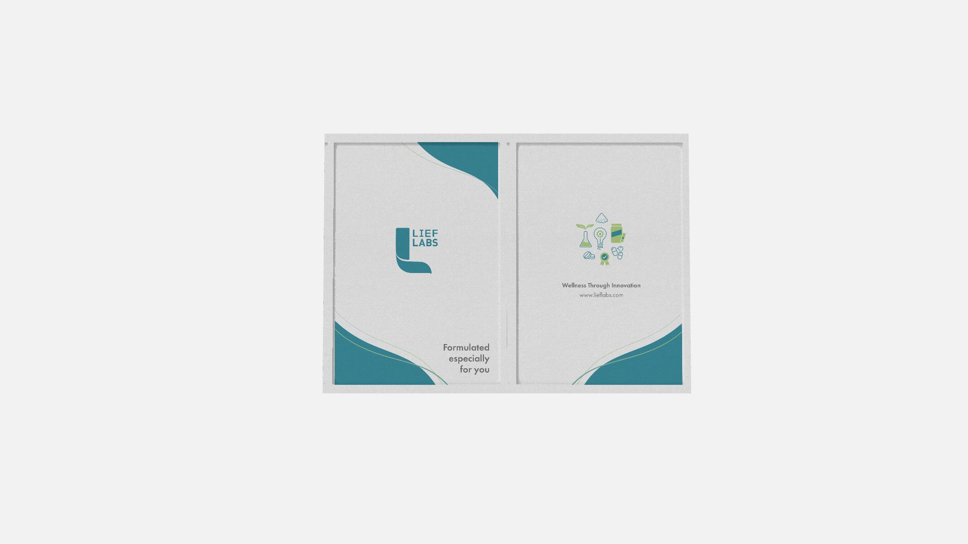
The identity went through a deliberate refresh rather than a reinvention: a quieter, more confident wordmark, a palette expanded well beyond the original industrial neutrals, and a type system built to scale from a spec sheet to a tradeshow wall without losing its voice.
Strategy first. Then the system.
The work started with research, not the design tools. The VPS framework — Lief's vision, positioning, and strategy — came out of customer interviews, sales conversations, and a competitive audit of the category.
Brand Pillars
Quality that delivers
Science-backed formulations built to perform and scale.
- Rigorous quality control at every stage
- Ingredients sourced for efficacy, not cost-cutting
- Compliant, credible, market-ready
Formulations that fuel growth
Custom formulation from concept to commercialization.
- No white label — every product is built for your brand
- Flavor expertise that drives repeat purchase
- Flexible formats across categories
Partnerships that last
A true partner invested in your brand's long-term success.
- Dedicated support from brief to launch
- Transparent, collaborative process
- Built for brands that are scaling, not starting
Tone of Voice
Premium & authoritative
Confident without arrogance. Lead with expertise, not hype.
“Lief Labs doesn't follow trends. We formulate ahead of them.”
Scientific & credible
Specific over vague. Proof over promise.
“Every formula starts with the data, not the label.”
Partnering & collaborative
Speak like a partner in the room, not a vendor.
“Your vision, our expertise. Let's build something worth taking.”
Clear & direct
No jargon for its own sake. Say the real thing, simply.
“We make supplements that work. That's the whole job.”
Words & Claims to Avoid
Only then did the visual identity follow. The positioning gave every later decision — the wordmark, the palette, the messaging, the rollout — something firm to answer to, which is what kept the system coherent as it spread across the business.
The discipline to stop saying certain things did more work for the brand than the things we started saying.

Premium, energetic, built to last.
A richer palette with depth and dimensionality. Typography overhauled to feel authoritative — every hierarchy and weight decision reinforcing the new positioning. Recognizable, but built to hold up in high-stakes rooms: trade shows, investor decks, enterprise sales.
Built to play big.
The brand also had to move. I produced a company hype film plus a run of event videos made for the largest canvases in the building — main-stage screens and the LED marquees that ring the Supply Side and Expo West floors — each one themed to its night.