
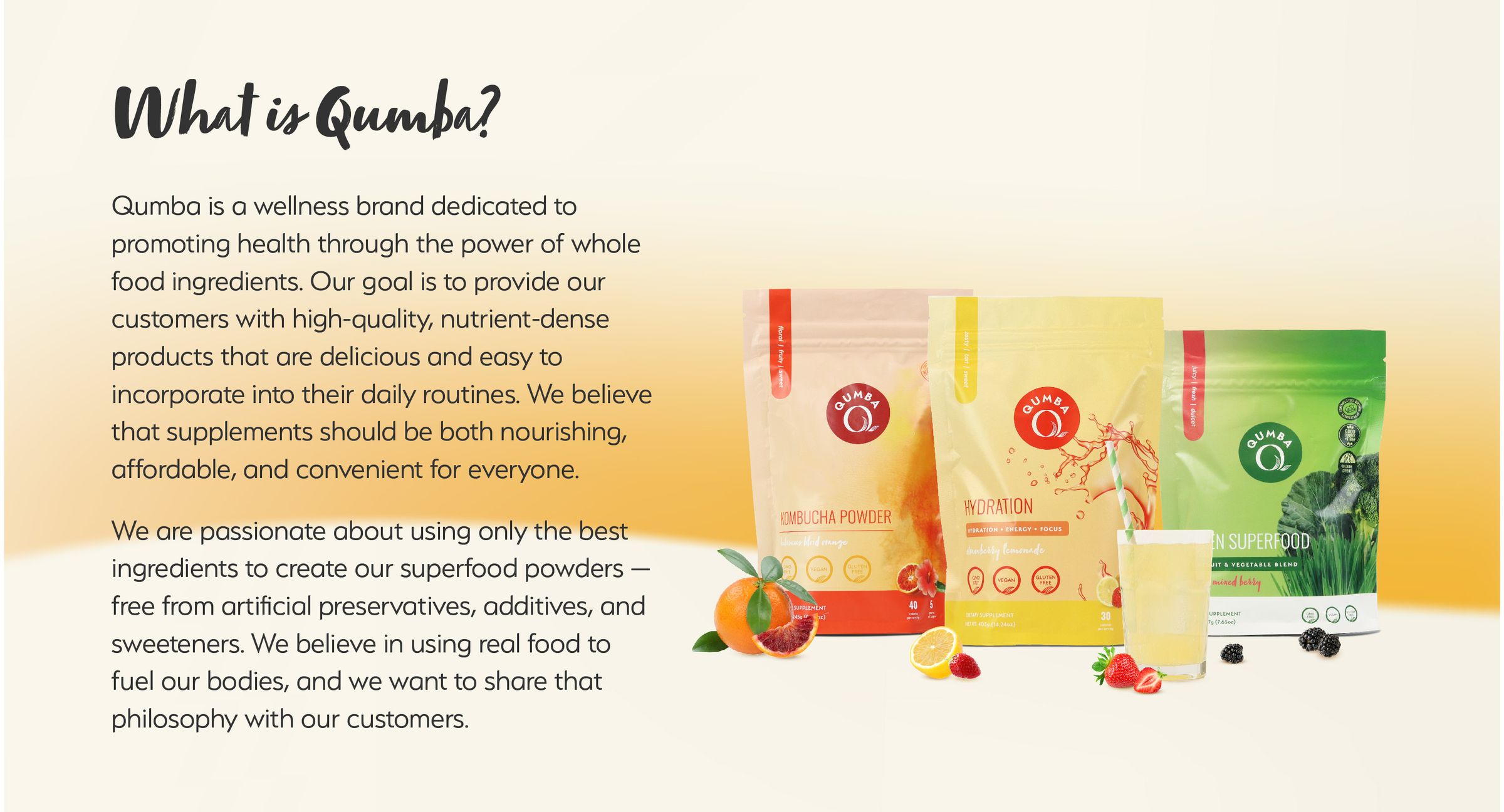
Qumba was a wellness brand born inside Lief Labs — and over three years I helped grow it from a single-product launch into a full multi-product line. The work spanned strategy, identity, packaging, campaigns, and the storefronts that brought it to market.
Where it all started.
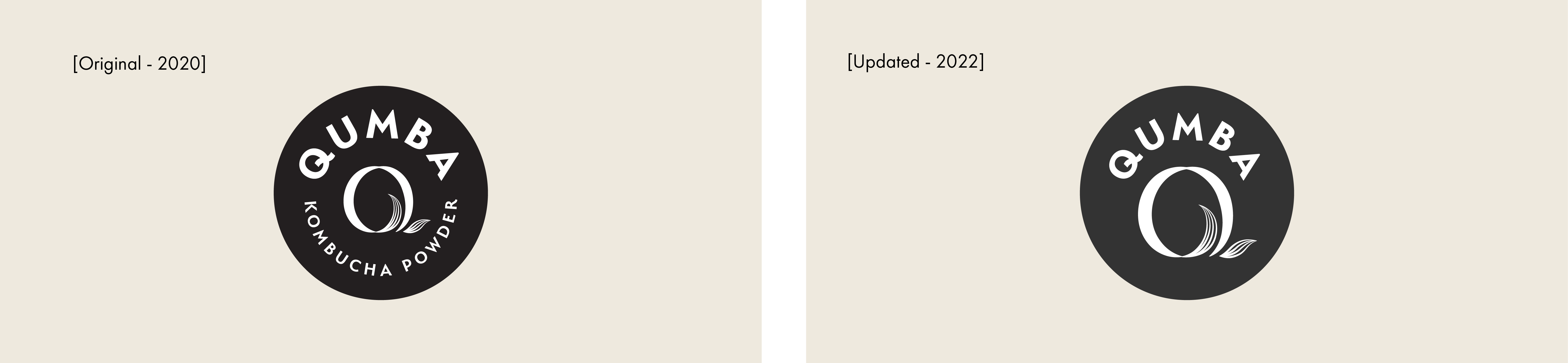
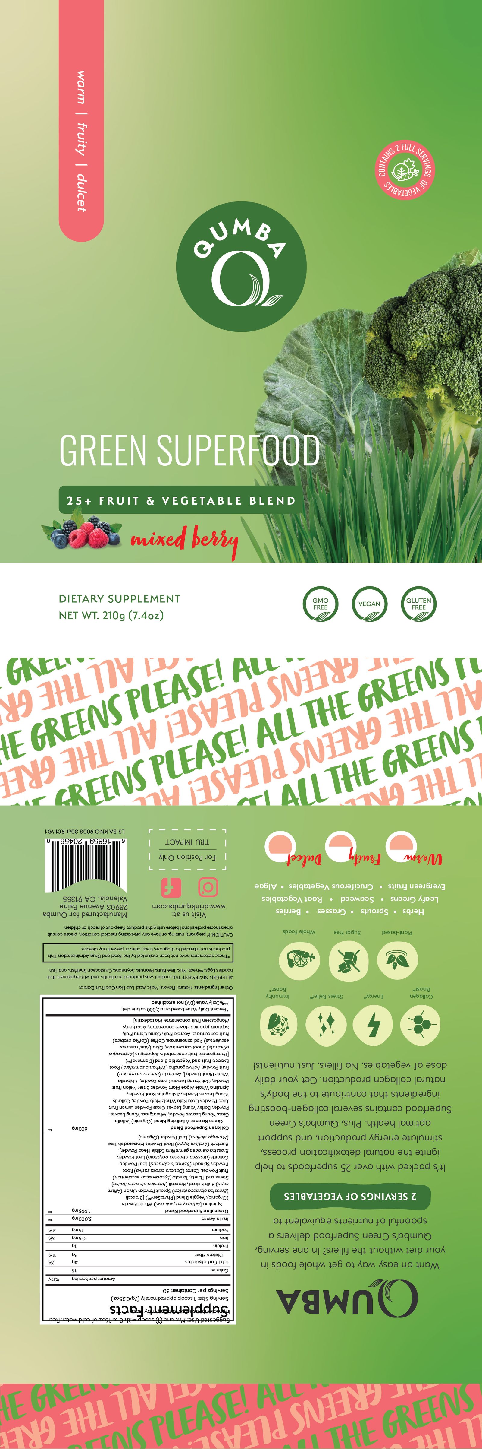
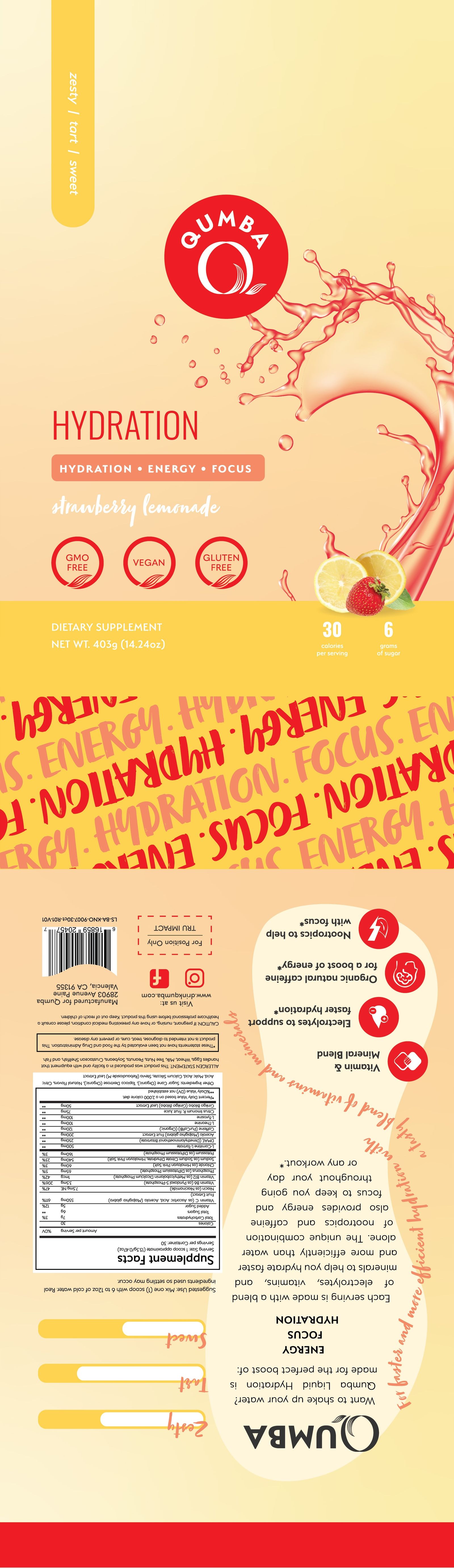
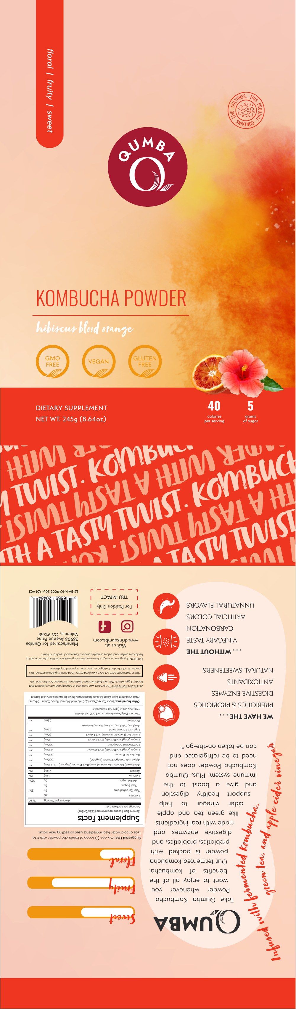
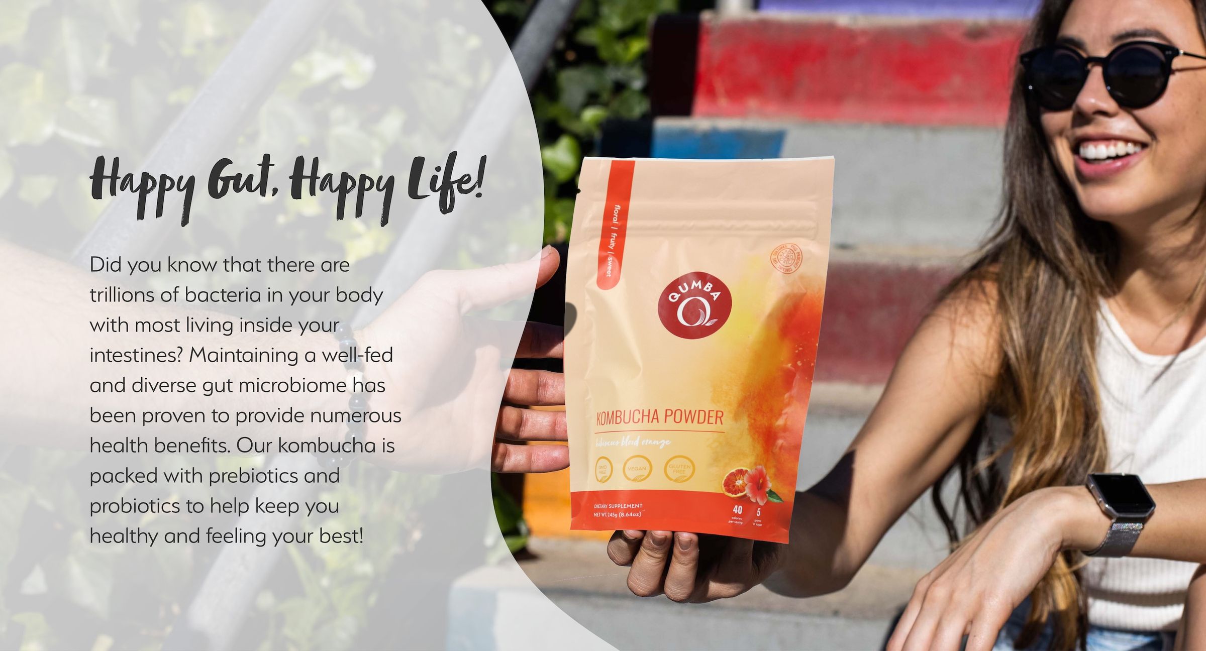
Qumba launched as a single-product brand — kombucha powder, one bold circular badge. Confidence and clarity: one product, one purpose, one unambiguous mark.
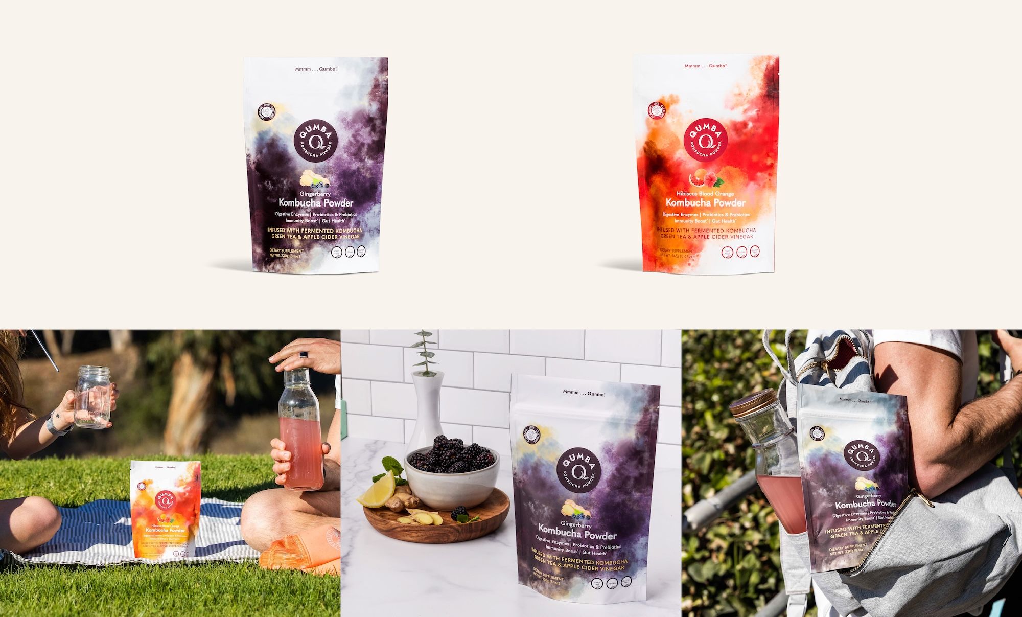
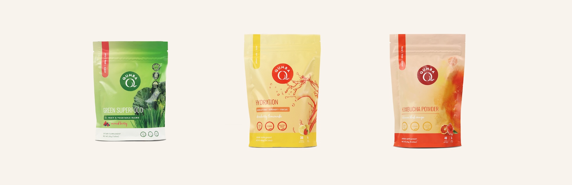
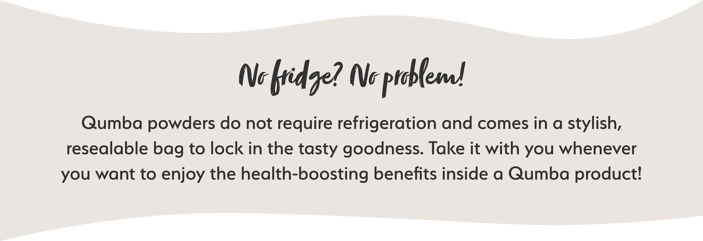
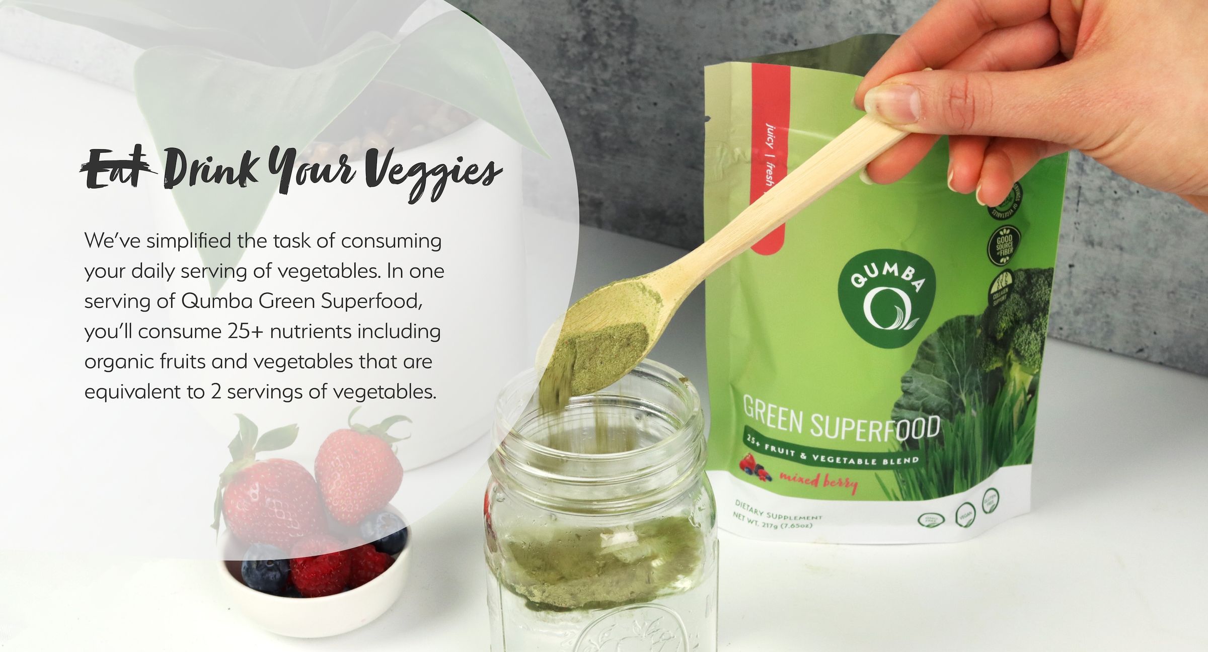
Over three years the scope expanded well past that original frame — into a multi-product wellness line across several SKUs, plus campaigns, Shopify, Amazon, email, and social.
Why we redesigned the mark.
The original mark did exactly what it was supposed to do — anchor a single product. As the line expanded, the rigid circular lockup stopped flexing: tight label layouts, digital environments, co-branding, small sizes.
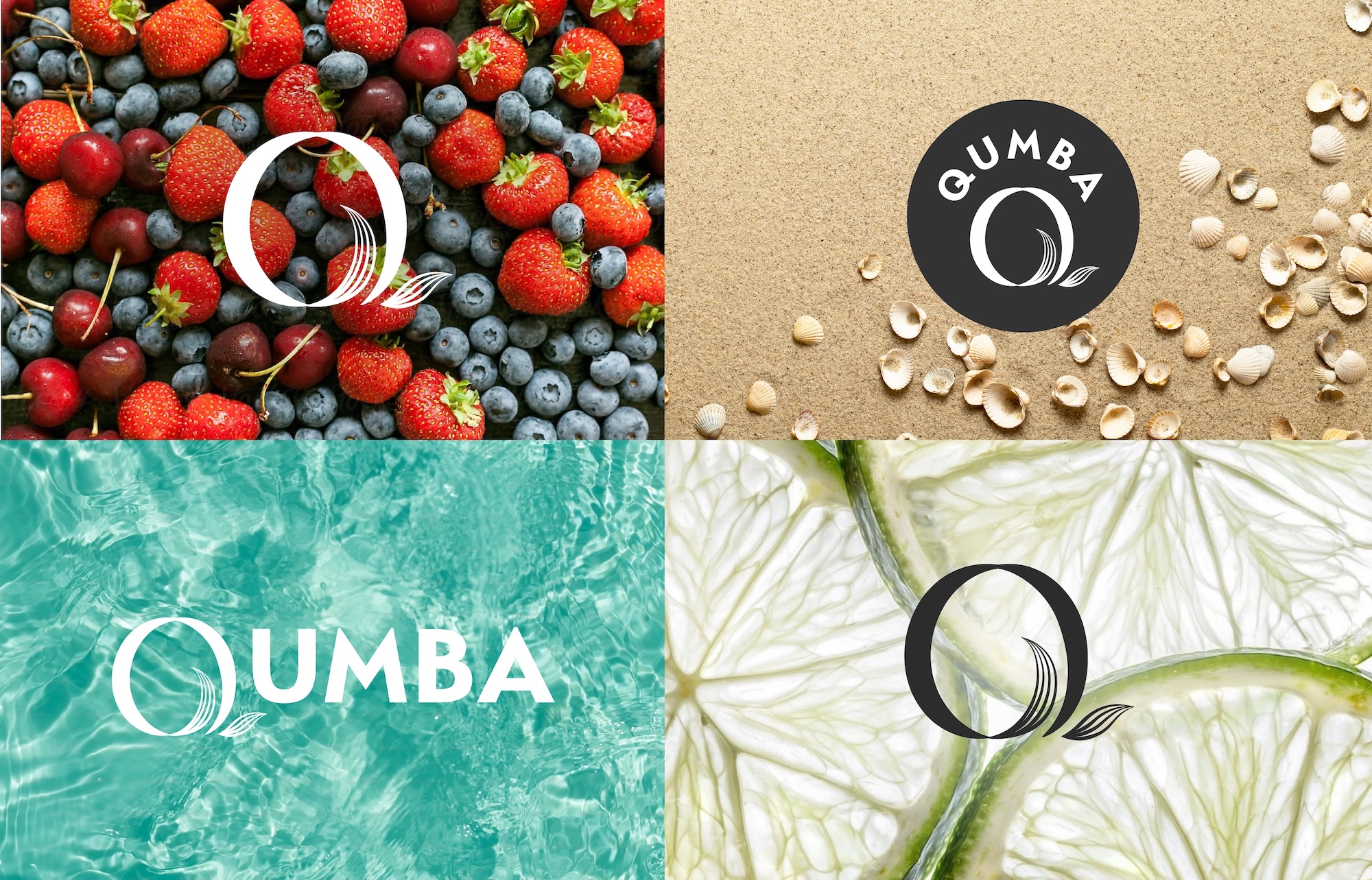
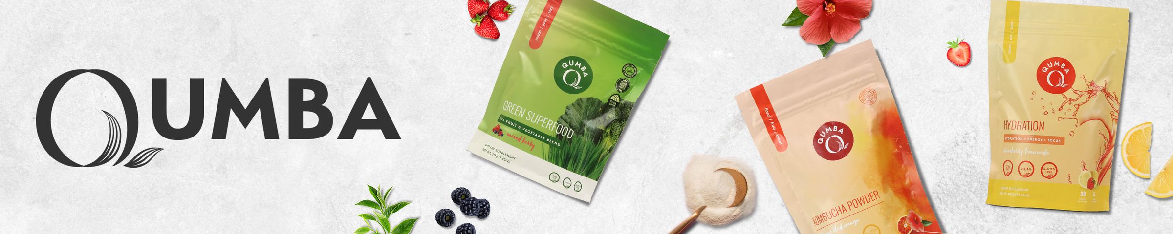
So we evolved rather than abandoned. The new direction kept the Q as the anchor and the brand’s naturalistic green world intact, but unlocked it from the badge into a system that could travel without losing its identity.
A system built to grow.
The refreshed mark tucks a leaf into the stylized “Q” — a quiet nod to vitality that carries across colorways and categories. Each product category owns its own color story while the mark holds the family together.
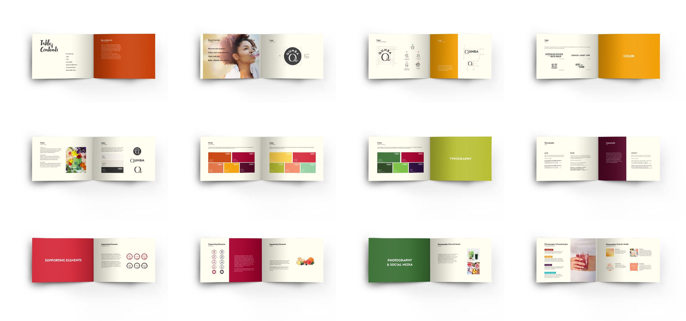
I designed it to live inside that color-coded system from the start, then codified everything — construction, palette, typography, photography — in a brand guide so new SKUs could slot in without breaking the system.
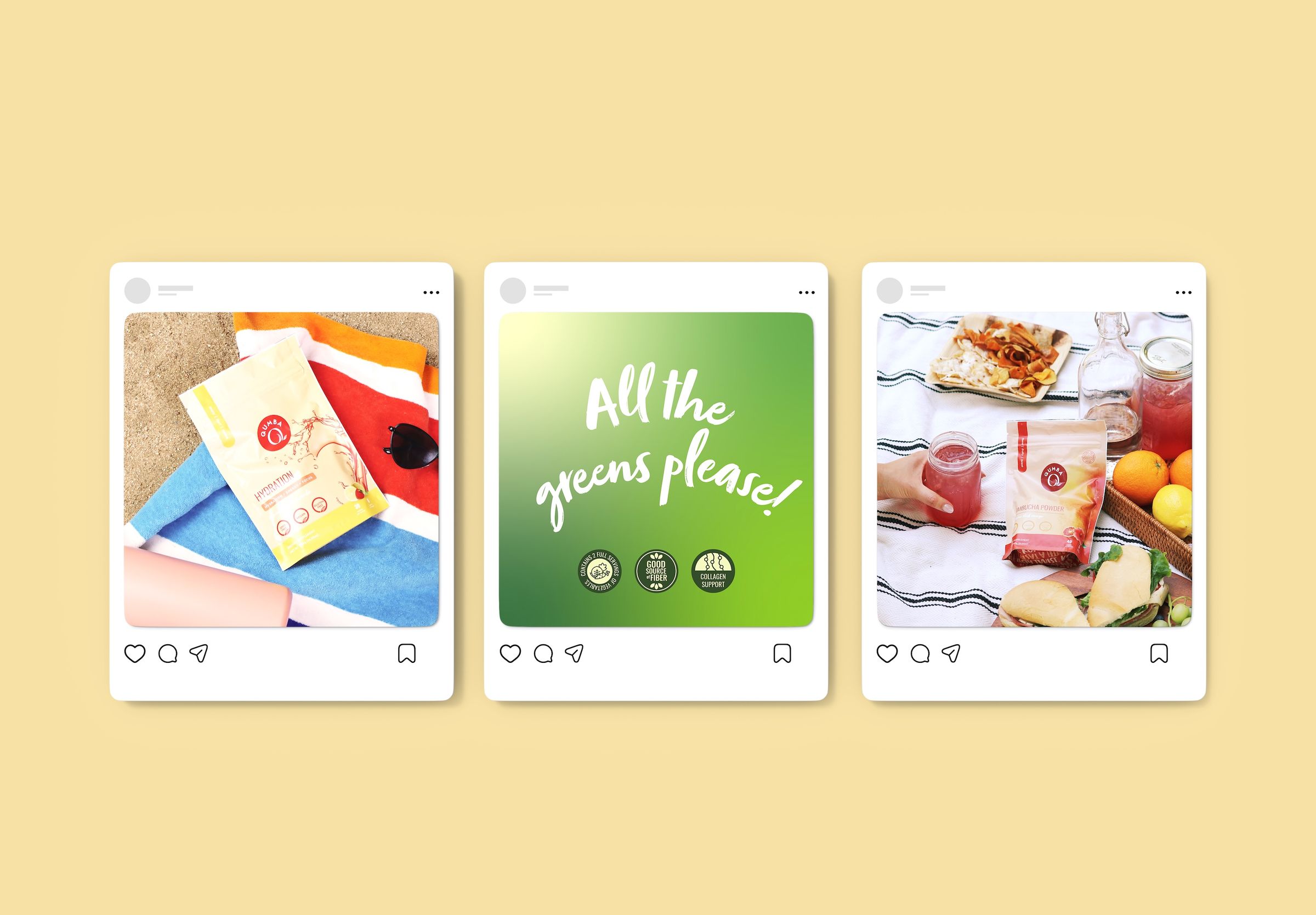
Strategy, content, community.
Branded social templates kept the feed, stories, and launches consistent through every seasonal moment, and customer replies fed straight back into product conversations.
Email did the heavy lifting — a steady cadence of campaigns to a list that kept growing across the brand’s life.
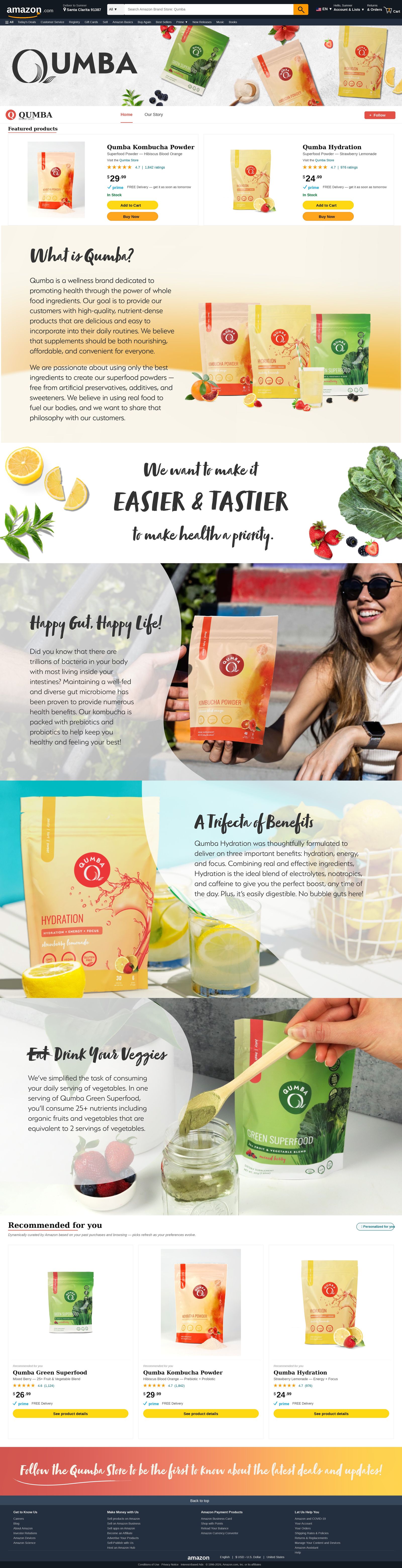
Shopify, Amazon, & beyond.
I designed and ran Qumba’s Shopify storefront — page design, product photography layout, navigation, and conversion copy — alongside the Amazon brand store, listings, and A+ content.
Both channels stayed in sync with every launch, so a new flavor showed up the same way wherever a customer found it.
Built from nothing.
Qumba was a genuine zero-to-one build across every touchpoint a brand can have. What started as a logo and a label grew into a full ecosystem with its own voice, visual language, customer base, and market presence.
It closed in September 2024 when Lief Labs wound the brand down — a business call, not a creative one.