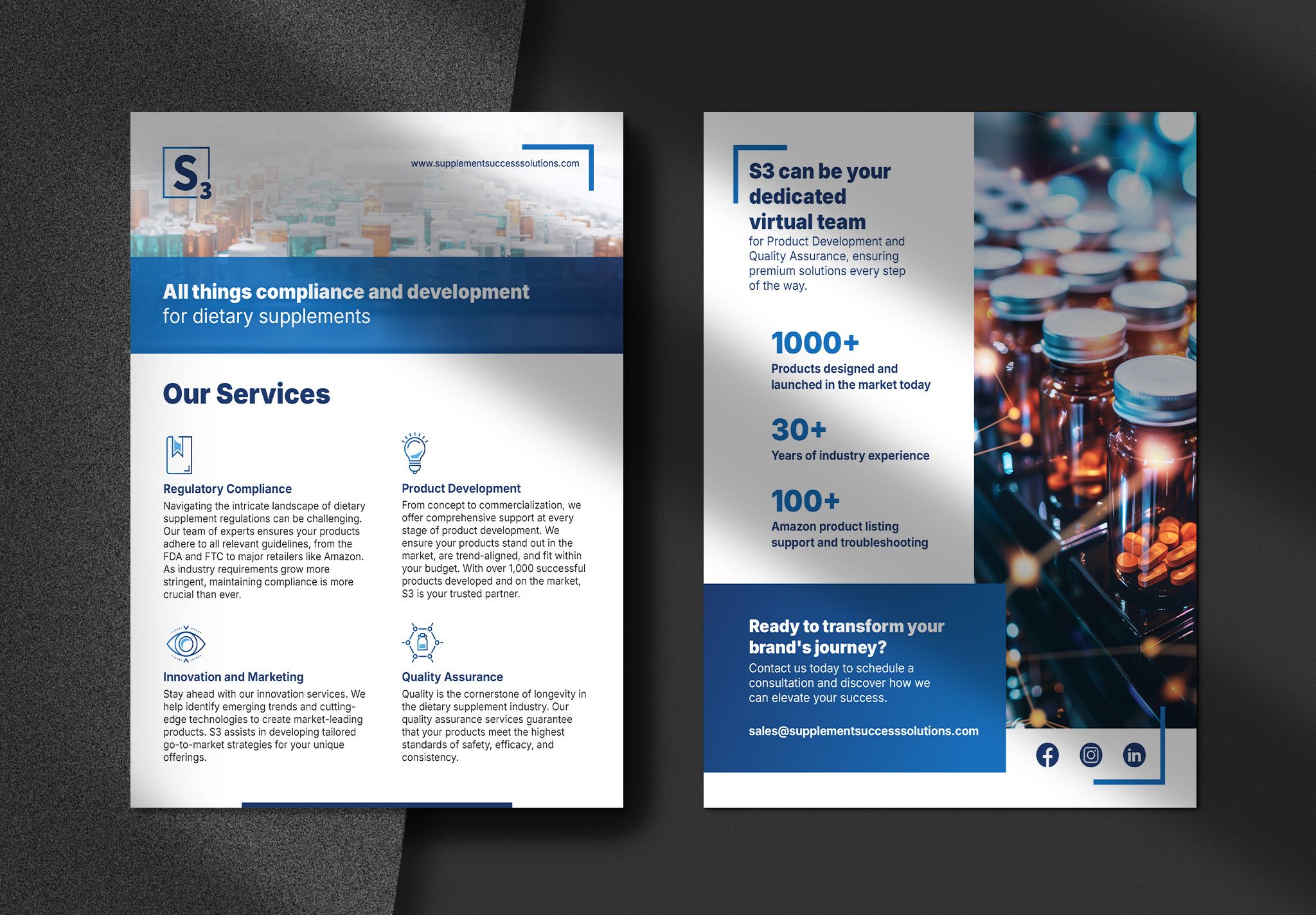
Supplement Success Solutions (S3) helps dietary supplement brands navigate compliance, product development, and quality assurance — the unglamorous, high-stakes work that keeps a product on the shelf. They came to me with a sharp value proposition and no visual language to match it, so we built the brand and the site from a blank page in two months.
Visit site →Building a brand from a blank page.
S3 had a sharp value proposition and no visual language to back it. The brief was an identity that signaled precision, credibility, and scientific authority — without tipping into something cold or clinical.
The real question underneath it: how do you make a service company feel as solid as a product? Founders deciding who to trust with their idea were the audience, which made every design choice a credibility question before it was a stylistic one.
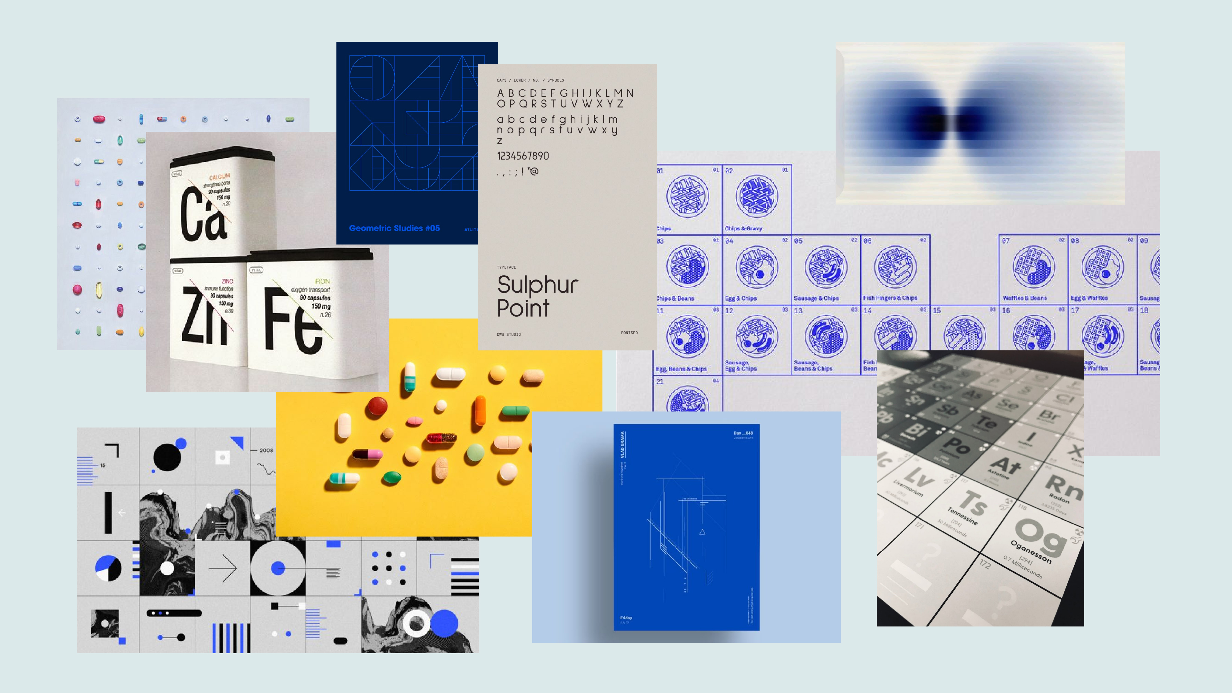
In a category that defaults to busy iconography and dense scientific signaling, S3 stood out by holding back.
Restraint as the strategy.
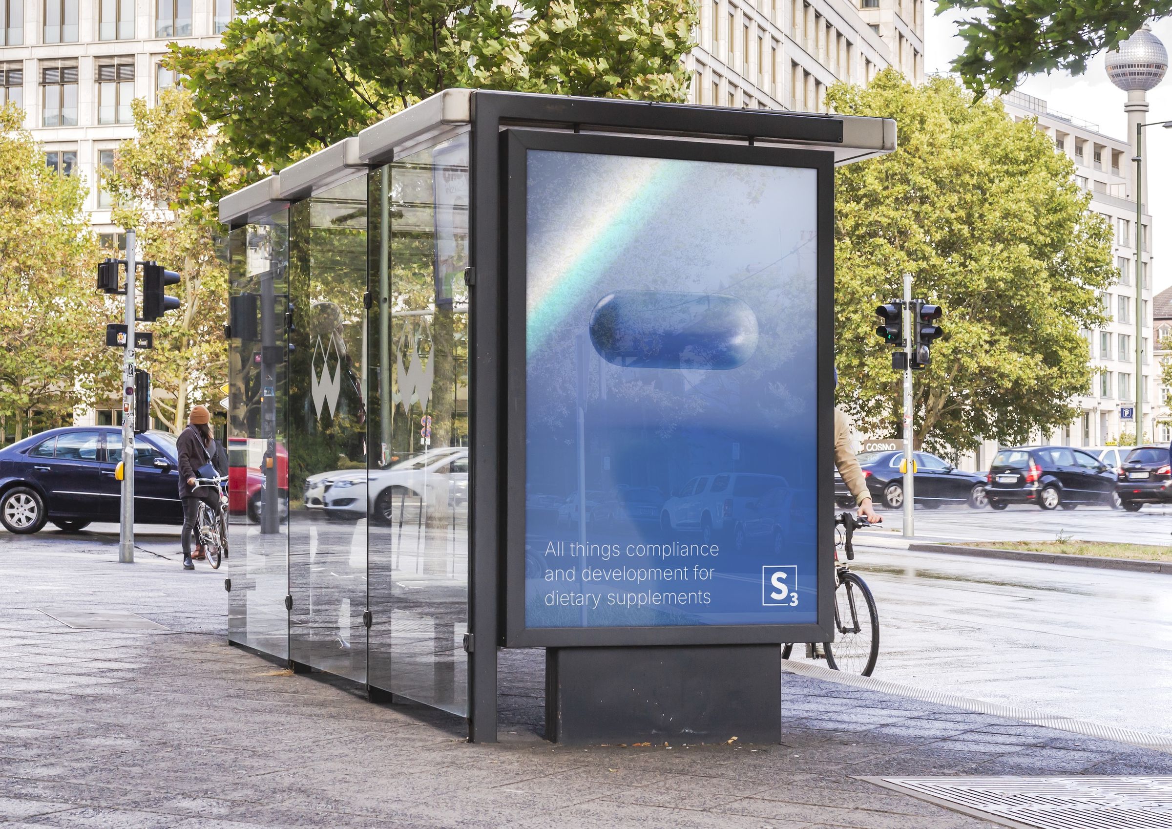
We led with restraint: a periodic-table-style mark, a single anchor color in navy, and a system minimal enough that nothing competed with the message of expertise itself. Credibility came from confidence in the simplest form possible — not from layering on more visual proof.
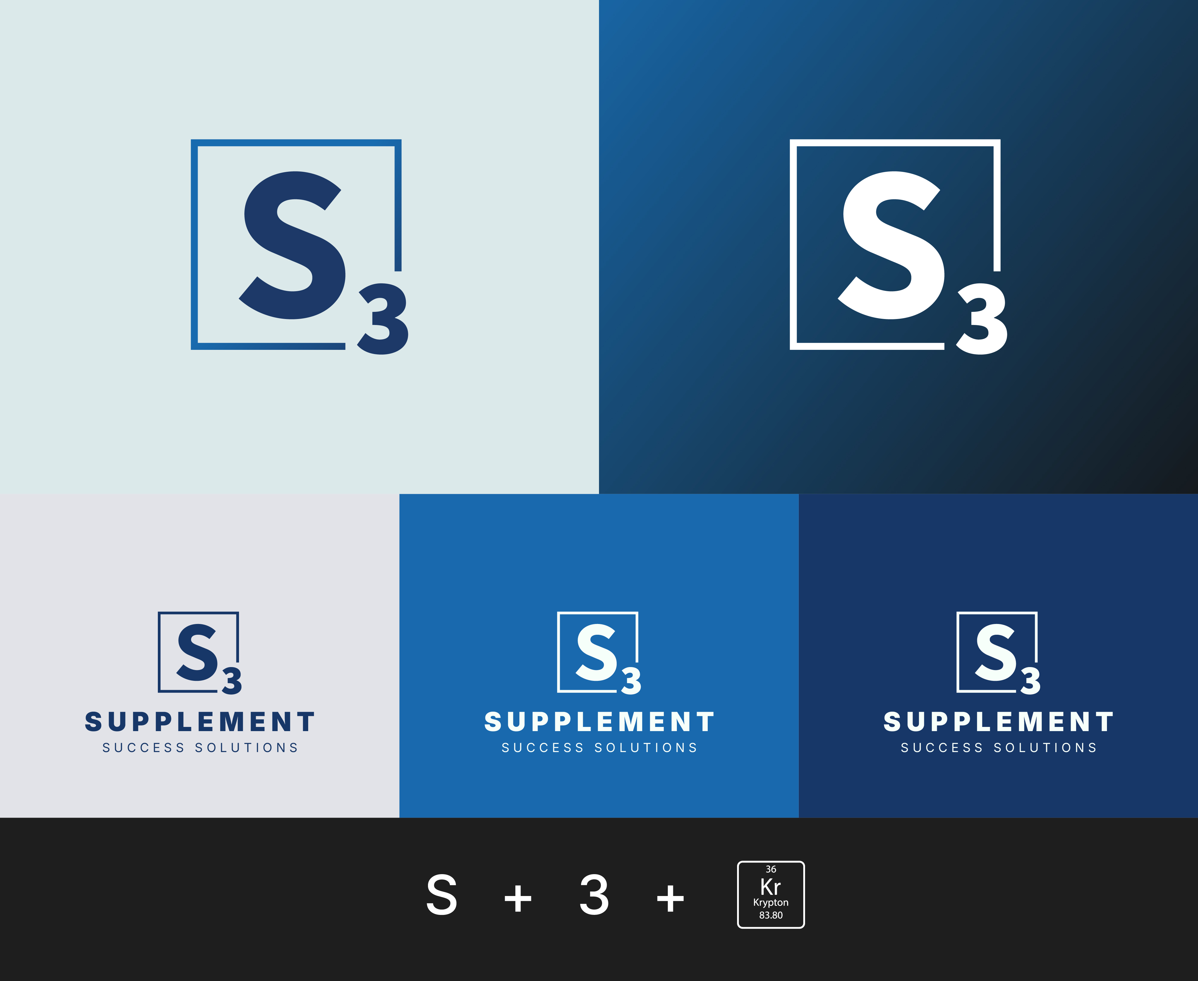
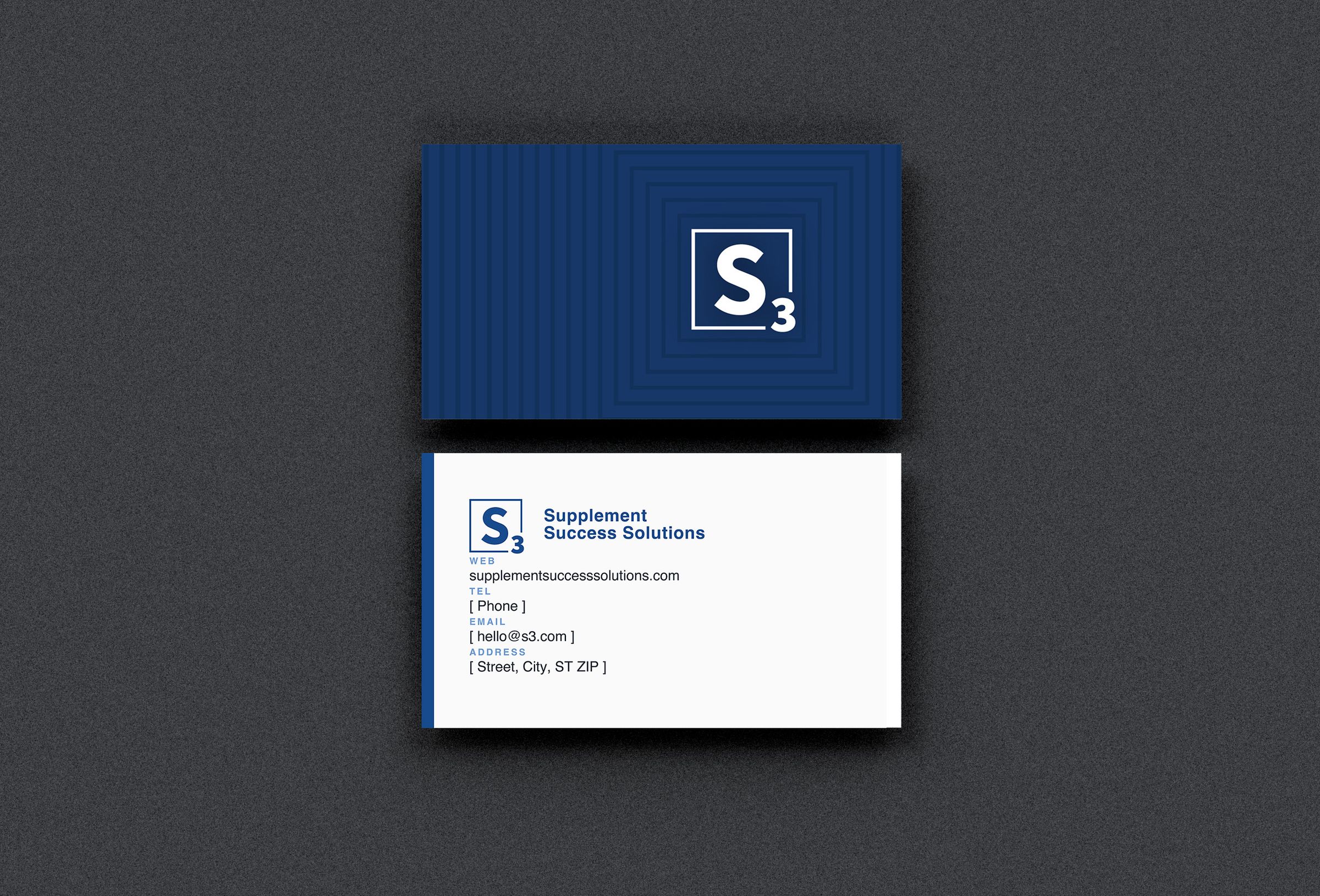
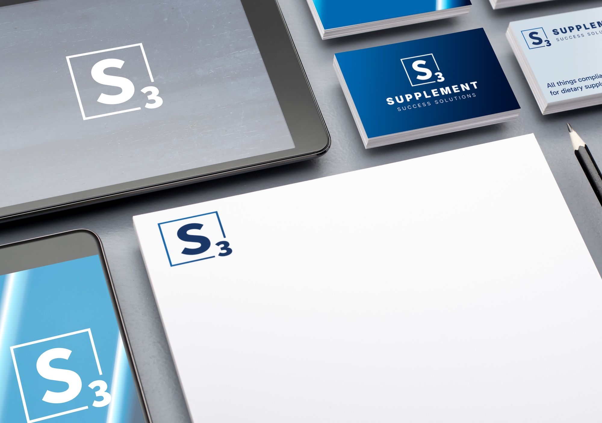
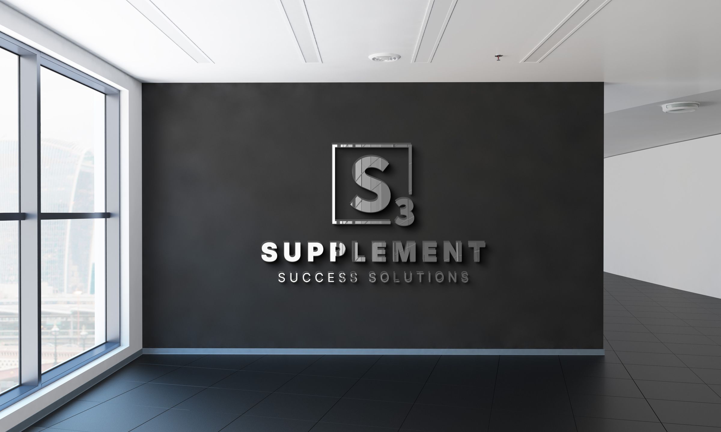
The mark.
The logo draws from the visual language of the periodic table — a letter inside a square box, the universal shorthand for foundational science. The “S” sits centered; the “3” tucks into the lower right. Minimal by design, in a category that defaults to clutter.
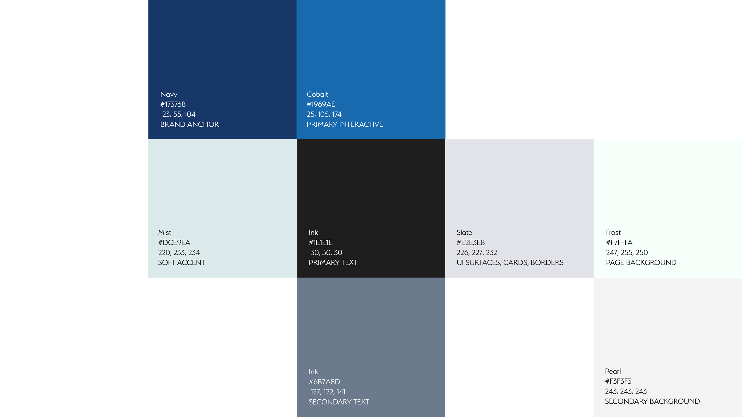
A palette built on trust.
A range of blues anchored by a deep navy. Trust, credibility, stability — the three things a compliance brand has to signal at a glance, before a single word is read.
One brand, every touchpoint.
Built to hold up from a business card to a compliance document. In a category where trust is the product, inconsistency is expensive — so precision became the brand's most consistent claim.

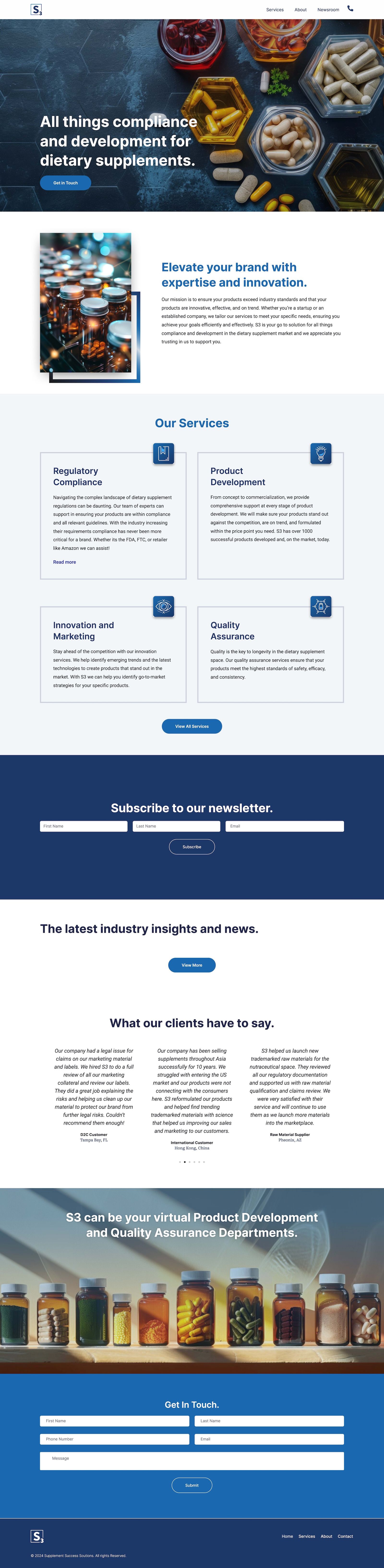
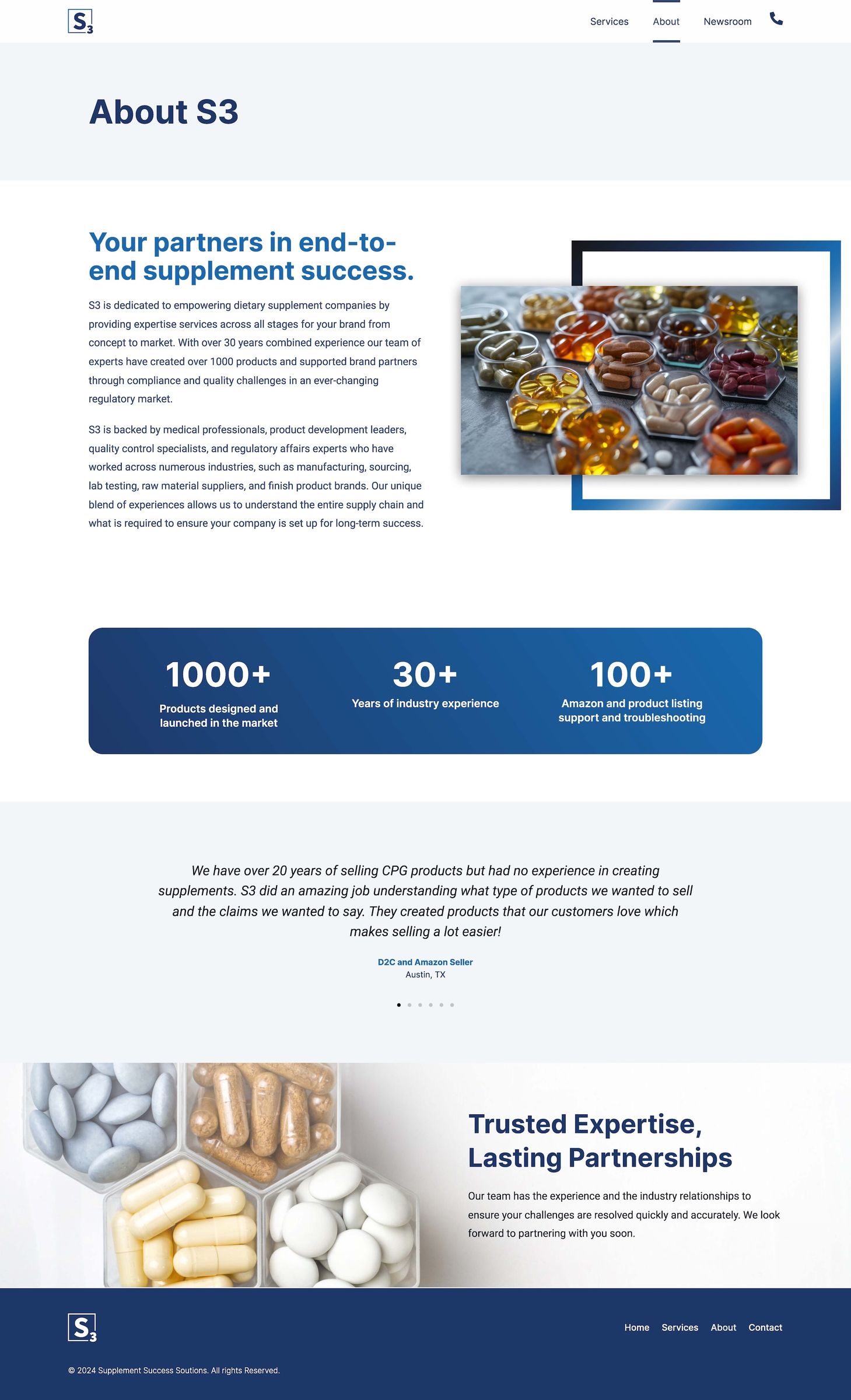
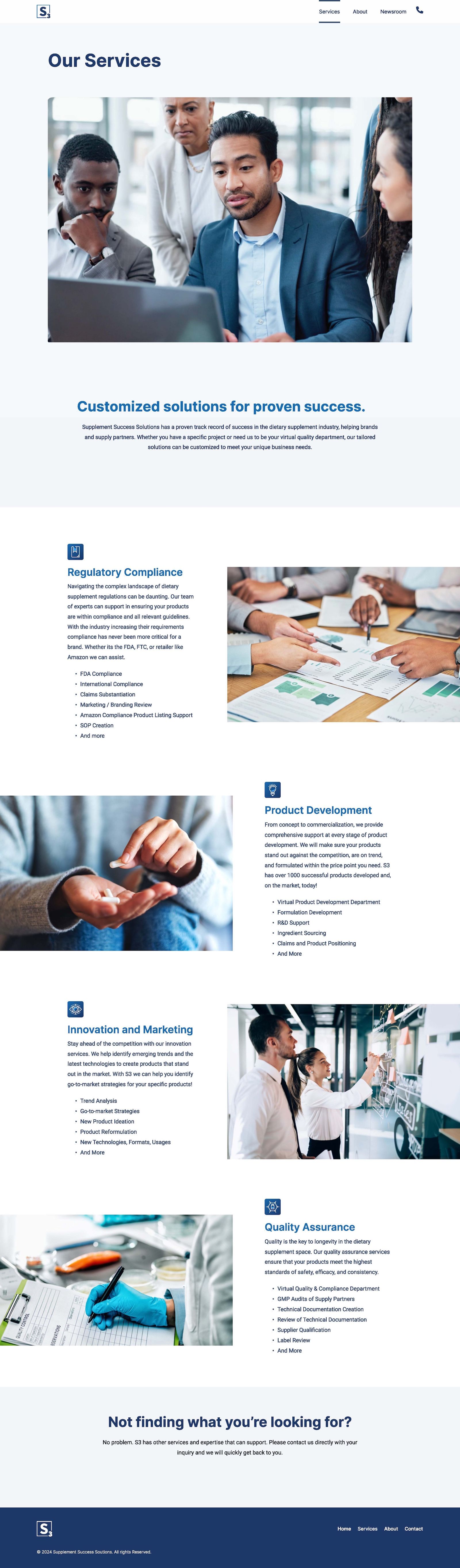
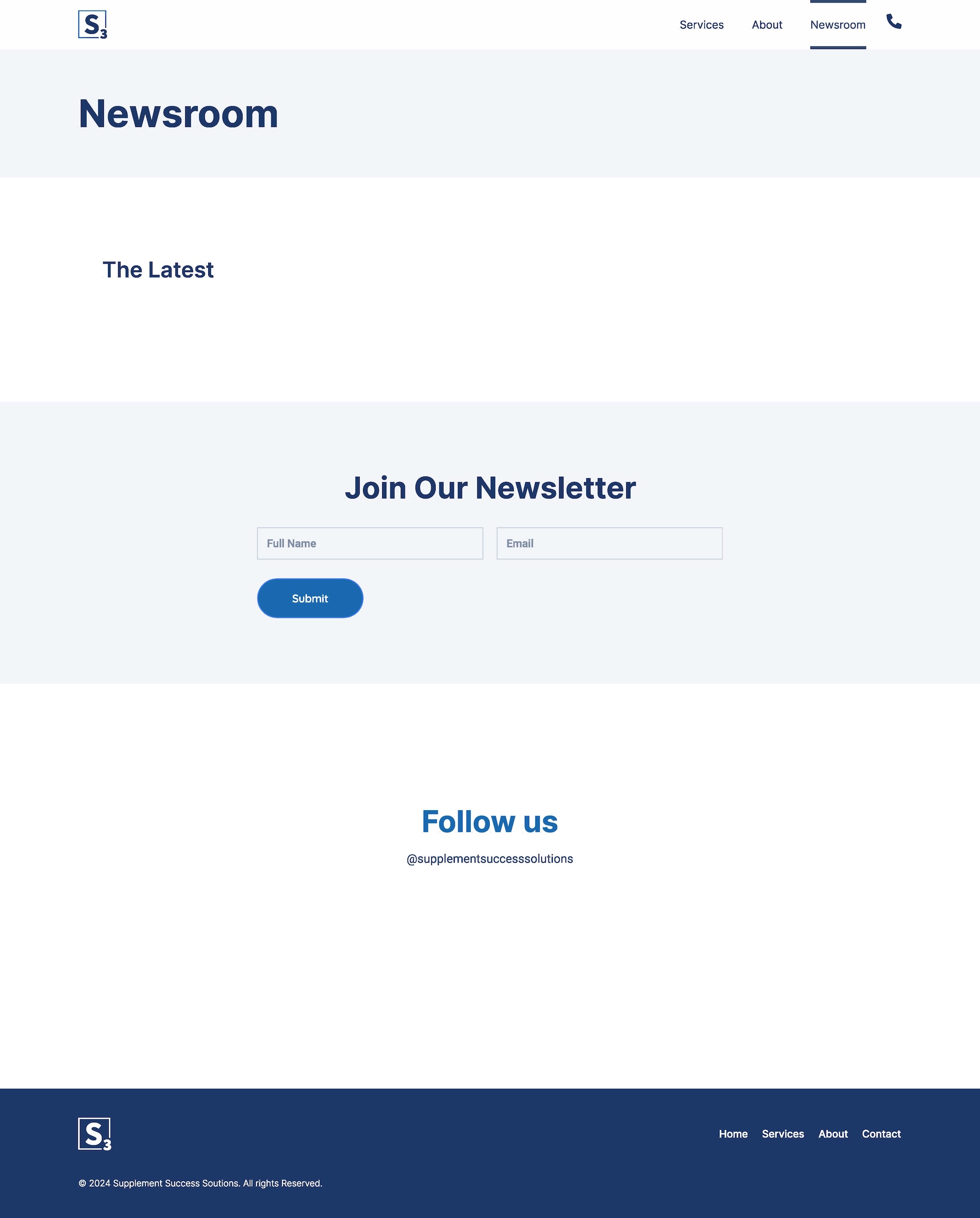
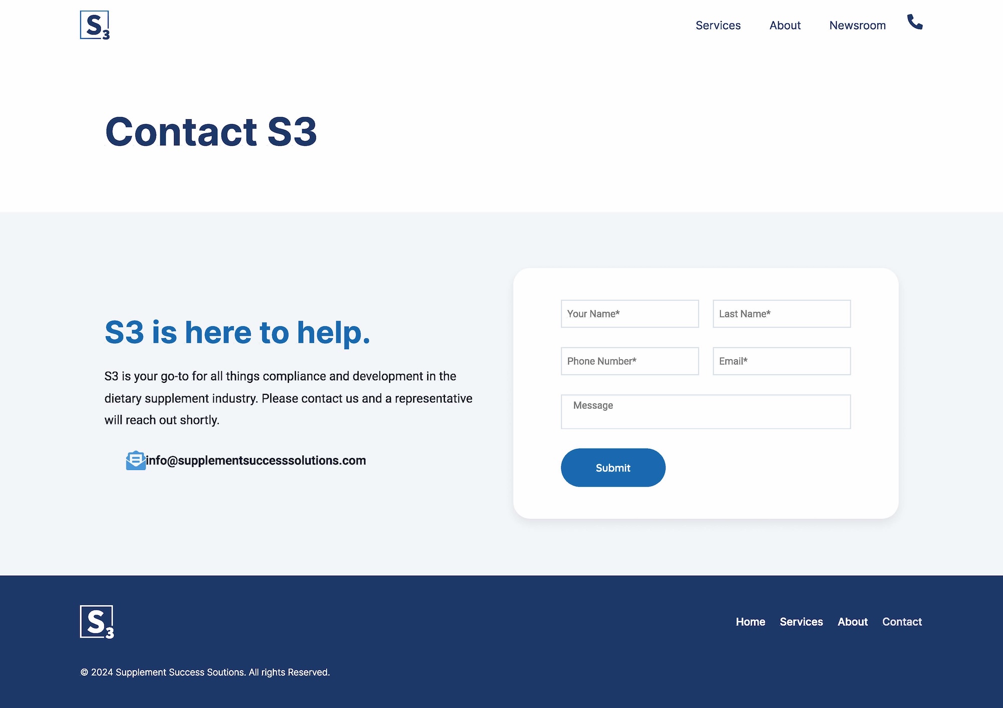
Taking the brand digital.
The site translates the identity into a responsive WordPress build, leading with the three things a prospect actually needs: what S3 does, why they're qualified, and how to reach them. Scannable depth, not scrolling fluff — credibility from the first scroll.